Tropican – canned drink packaging
Designing can prints:
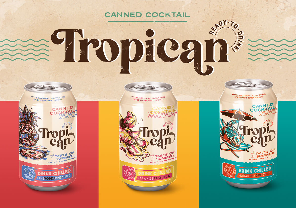
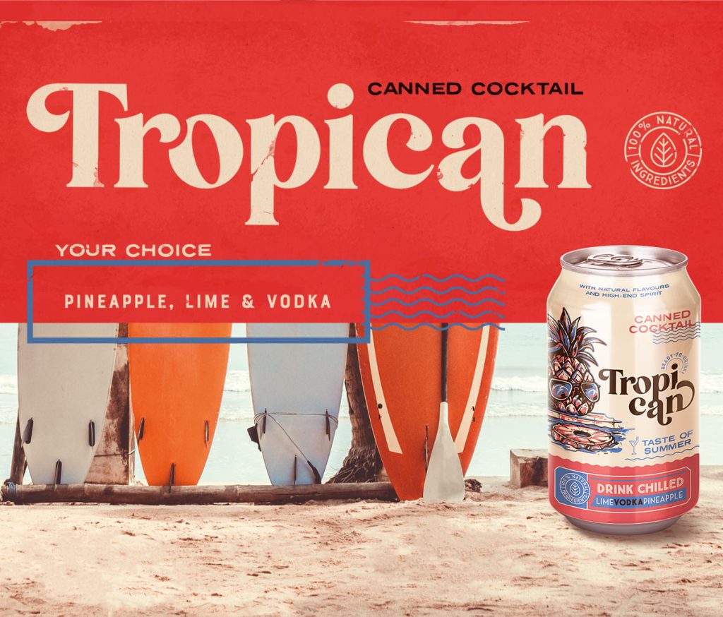
Creating designs for can prints involves considering technological limitations, especially when it comes to printing on aluminum cans.
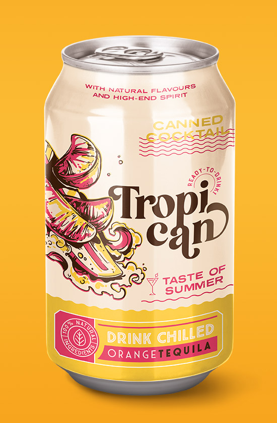
The decision to work with flat colors and illustrations was strategic, turning the challenge of printing on cans into an advantage. This approach ensures that the final prints on cans look vibrant, saturated, and appealing.
Can prints – branding
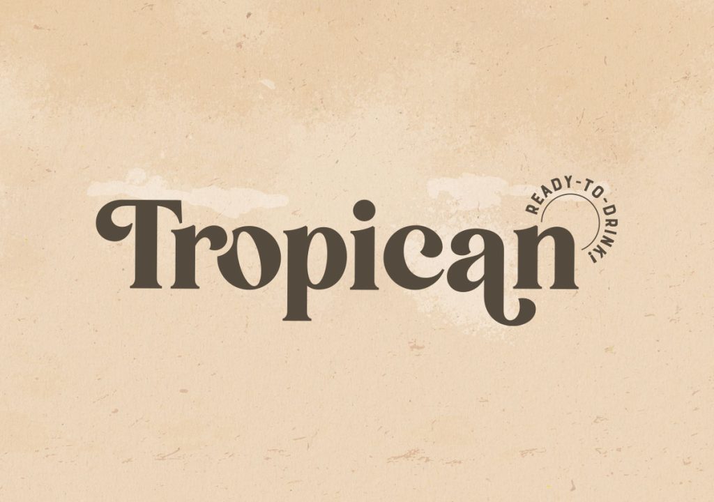
The use of flat colors without tonal transitions enhances the visual appeal of the can prints. The design includes careful planning of information placement, with a focus on making the product name prominent. The product logo, split into two lines, contributes to improved readability and an aesthetically pleasing composition.
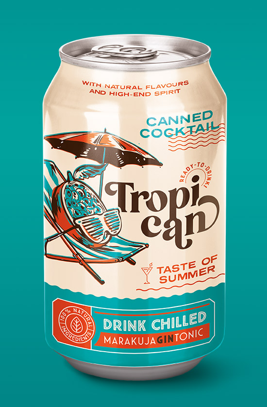
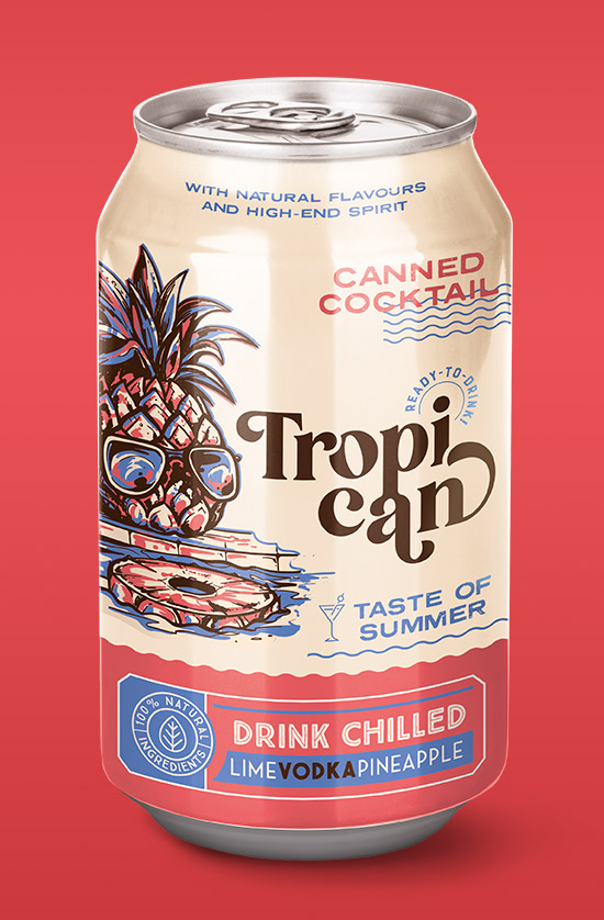
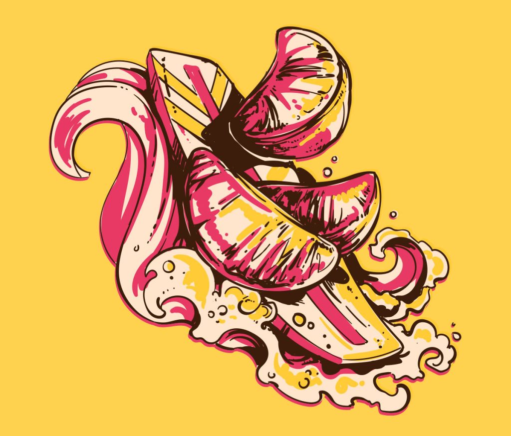
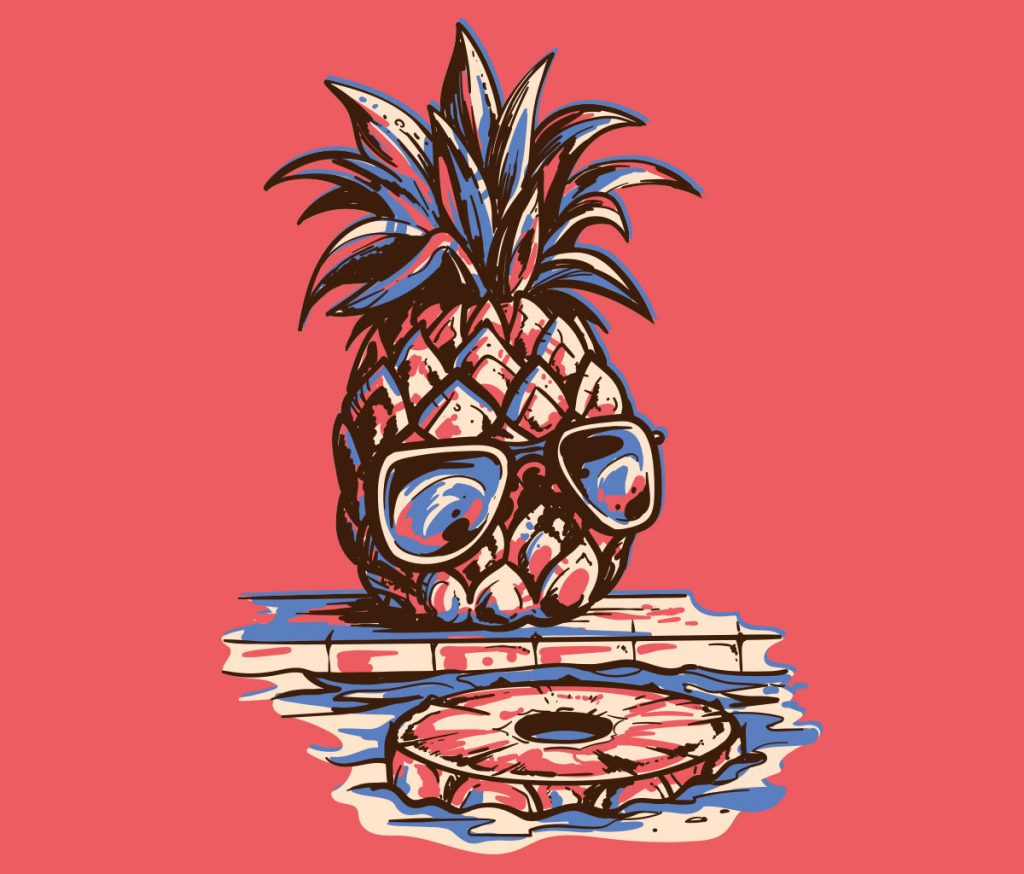
Each drink in the Tropican lineup has its unique color scheme and illustration, maintaining a cohesive and recognizable graphic design structure.
This consistency, along with proper logo exposure, ensures that these drinks are easily distinguishable from competitors, contributing to strong brand recognition.

Original illustrations and more:
To complement the can designs, we created original illustrations, adding a holiday feel, lightness, wit, and a sense of fun to the overall aesthetic. The use of experienced and talented illustrators ensured that these illustrations remain distinctive to Tropican, avoiding the risk of appearing on competitors’ packaging.
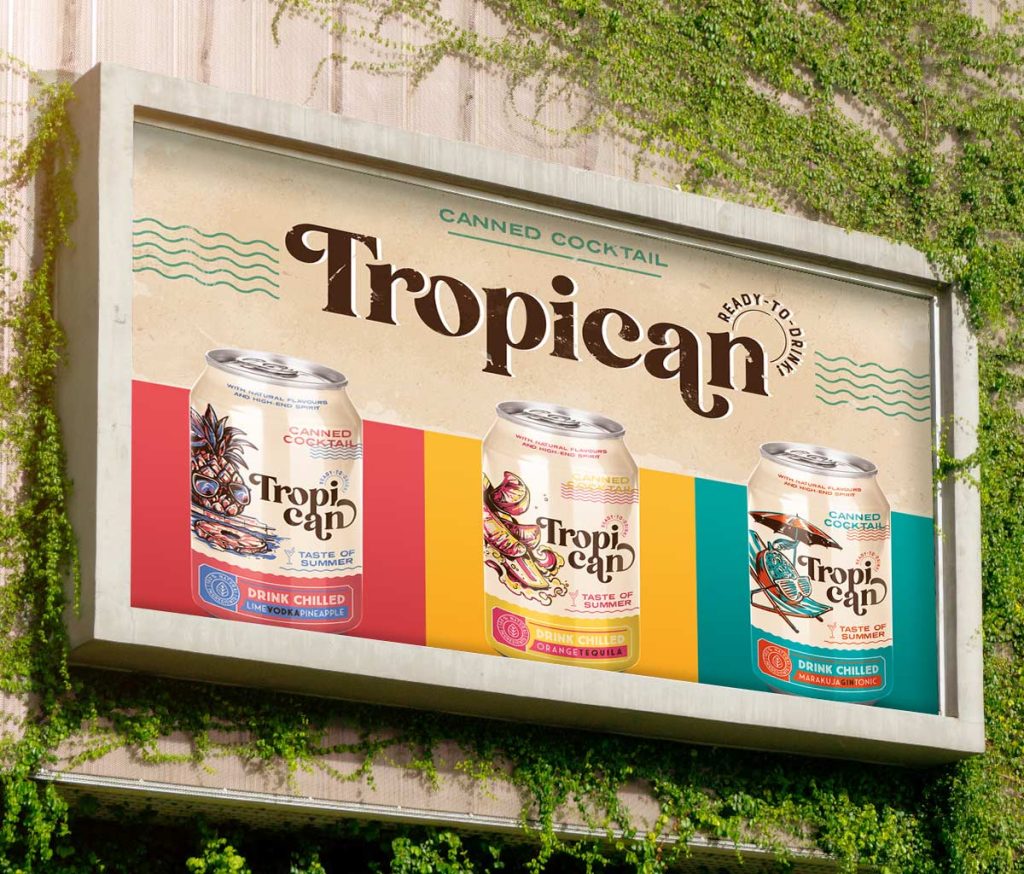
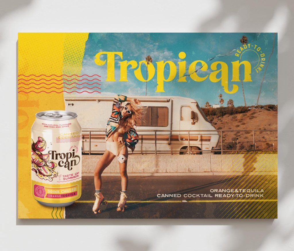
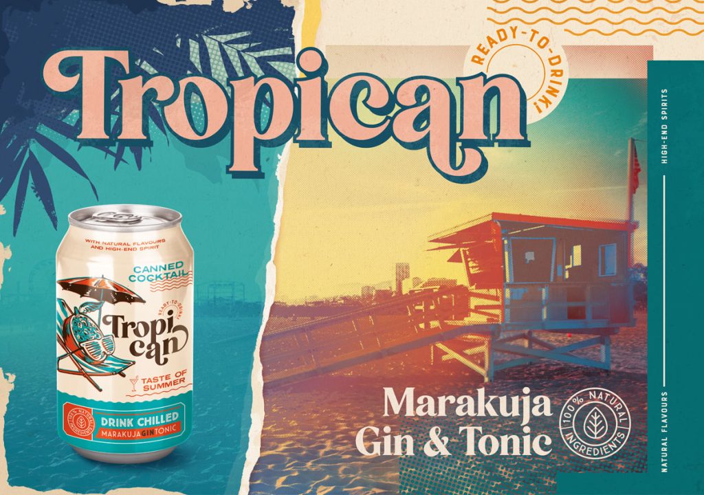
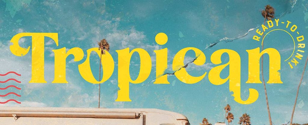
In addition to can designs, promotional graphics tailored for social media and other platforms, including postcards and posters, were developed. This comprehensive approach aims to make Tropican a memorable and stand-out brand in the market.

Let’s create something great together!
Request a free quote.
Contact
Similar projects
