Product branding – Sora

Brand design
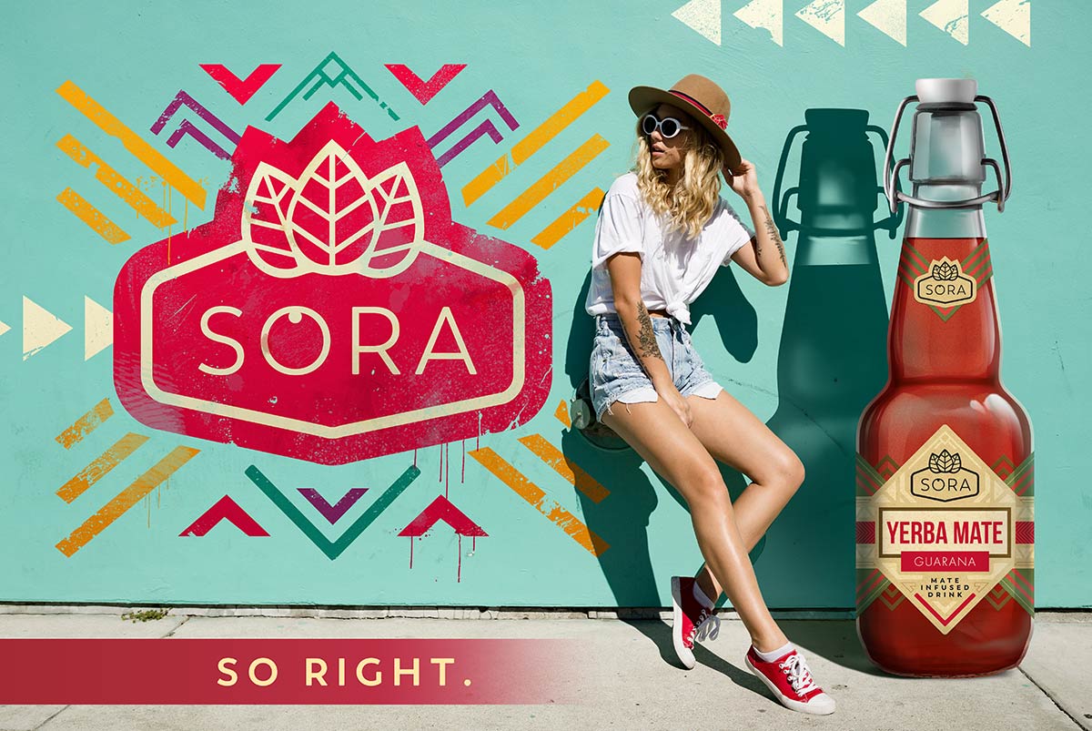
Thanks to such a comprehensive approach, we had the opportunity to have full control over the product’s image, resulting in cohesive designs. Our goal was to create a brand image that emphasizes natural ingredients, is dynamic, and modern.
Sora labels – key elements
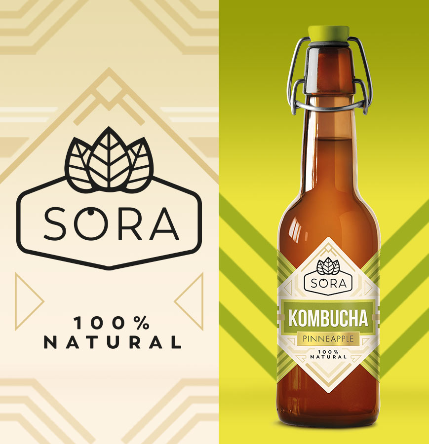
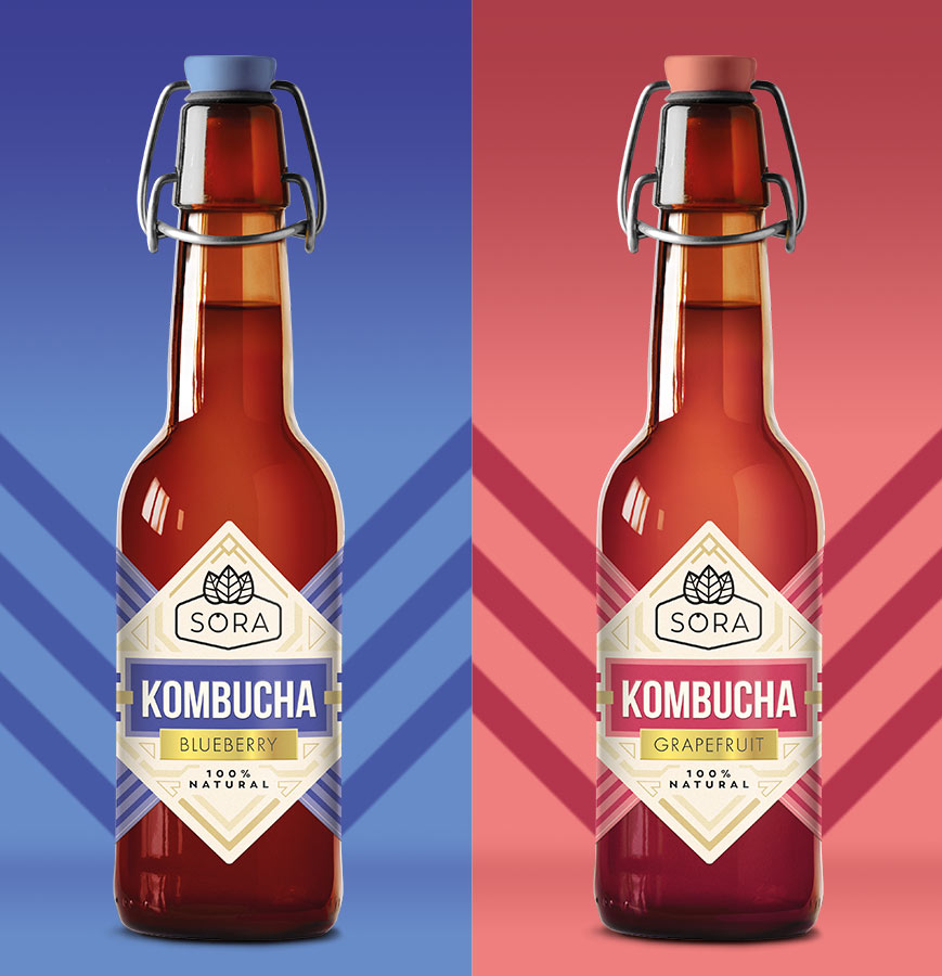
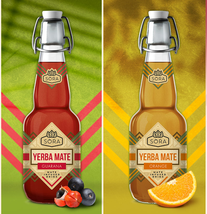
The visual axis of the label designs for kombucha and yerba mate-based drinks is the prominent product name, clear logo, and flavor description. The distinctive shape of the label makes it visible from a distance. We used natural background colors, instantly positioning the labels on the correct shelf. Combined with carefully chosen complementary colors, this resulted in a very interesting effect. We opted not to include fruits on the labels to maintain the purity of the message. Designing labels for Sora drinks required the fusion of elegance and modernity.
In the SORA logo, we subtly added a dot in the letter O, using this minimalist technique to liken it to a fruit.
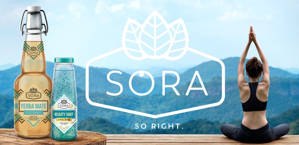
What to do if there’s no budget or time for photoshoots?
No worries, we’ve got you covered! We designed a series of graphics for social media and posters. These graphics are based on photomontages because sometimes deadlines don’t allow for waiting for label deliveries from the print shop. In such cases, you have to work simultaneously – and we assure you that you can count on us in this aspect.


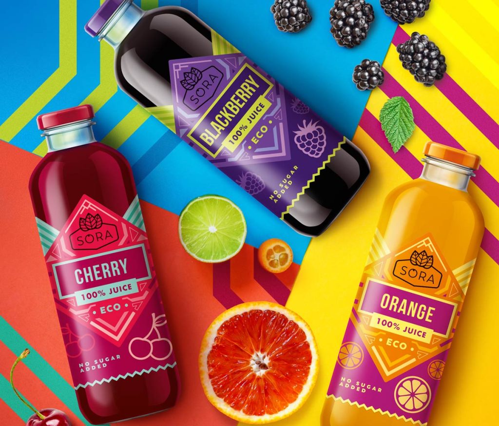
Colorful labels for Sora juices
In addition to the consistent line of labels for kombucha and yerba mate, we also created a slightly tangential line of labels for juices. It is based on the same shapes and typography but distinguishes itself with bolder colors and minimalist fruit illustrations. This resulted in more energetic designs, better suited to this product. It’s not always about mindless consistency across the entire product range, but about the effectiveness of promotional efforts for individual lines or even individual products. Consistency is important, but the key is a clear message and an aesthetic end result.
The branding of the SORA juice line turned out to be a bullseye. This way, we created interesting, unconventional designs that are visible on the shelf and, most importantly, can capture the interest of customers!
Let’s make something great together!
Request a free quote.
Contact
Similar projects
