Dark Marina vodka label design
Unfortunately, with the fall of communism and the health issues of the founder, there was no one to legalize and expand the production. The entire venture was thus suspended, seemingly indefinitely. However, after another 30 years, it came back to life thanks to the grandson and great-granddaughter of the original founder. They infused new spirit, dusted off classic recipes, and took care of the brand’s professional image. The first label and branding designs for the revived brand were born in the household, which posed many limitations on such creations.
Family heritage and the new approach
The previous logo featured a helm motif, and we also adhered to this association. While other ideas emerged during the creative process—such as a lighthouse, ship, diving suit, kraken, or compass rose—the client ultimately requested a combination of several proposed directions. They wanted to move the helm away from the text and include a wealth of embellishments. At this stage, a decision was also made to change the color scheme of the labels. Instead of the previous black, white became the dominant color. From the beginning, we knew we wanted either the helm or compass rose to remain in the product logo, so this matter was quickly resolved.
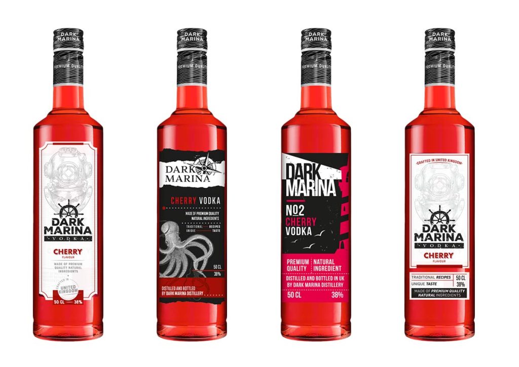
Insight into Preliminary Designs
After thoughtful consideration, consultations, reviewing the competition, and delving into the identity of Dark Marina, we began working on initial concepts. Following the sketching phase, it was time to transfer selected ideas onto the computer screen. This division—sketches on paper, selection, and then moving to the computer—allows for a better assessment of ideas. A classic pencil sketch forces the designer to focus on the main label idea, preventing them from delving into details or getting bogged down by choosing the right font. Here’s how the initial ideas looked on the screen. From these, we selected four to refine and present to the client.
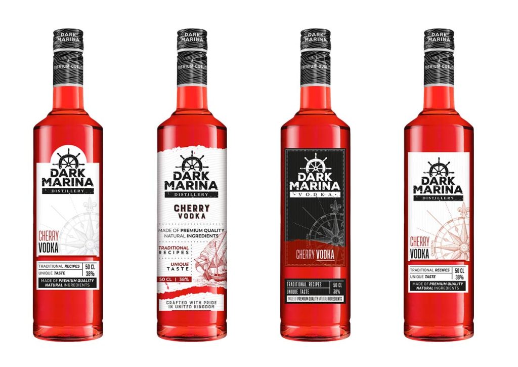
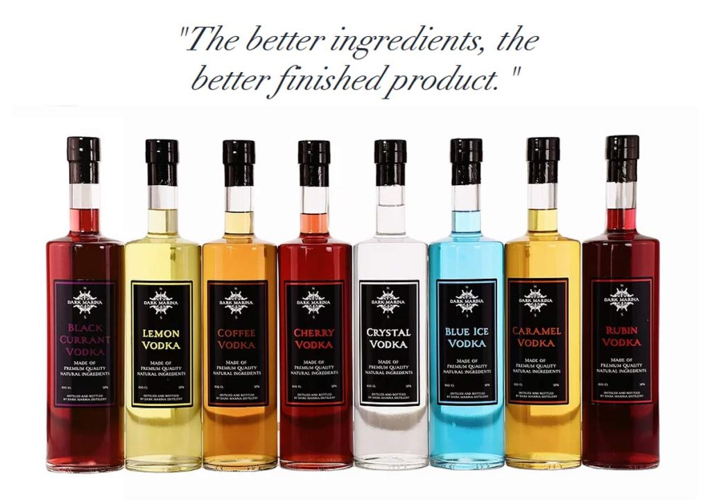
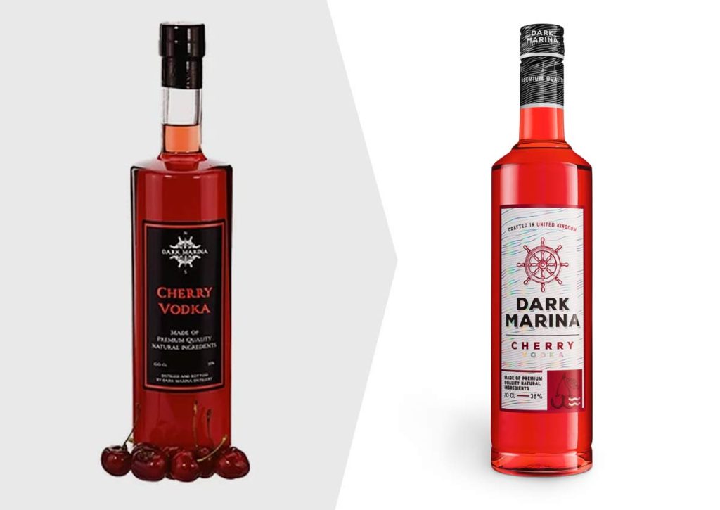
Final result – refreshed labels
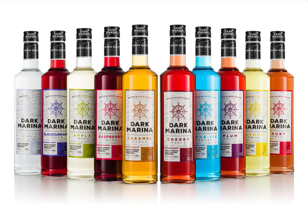
New product range
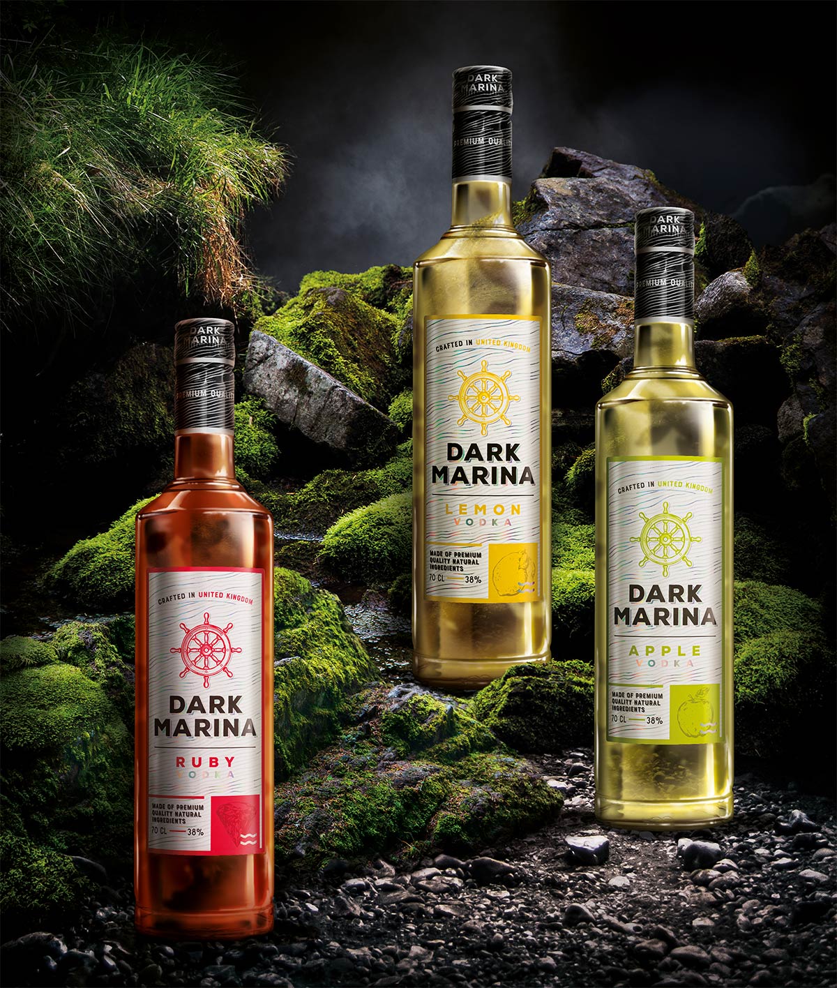
Staged photography

After designing and obtaining approval for the new labels for the Dark Marina brand, we sent them to our friends at Produktownia.pl for a photo session. When the client requested staged photos, we opted for photo editing. A condensed preview of the creative process can be admired in the form of an animation. Of course, it looks so light, easy, and enjoyable only in such an assembly. In reality, the work involved meticulous combing through a stock of photos to find the best arrangement of stones, transplanting moss from one stone to another using Photoshop, and painstaking work on lighting and fluid transparency to make everything look realistic. You can see the static final result below.
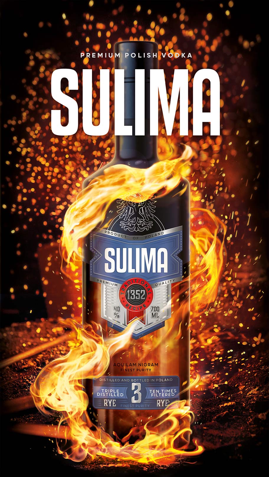
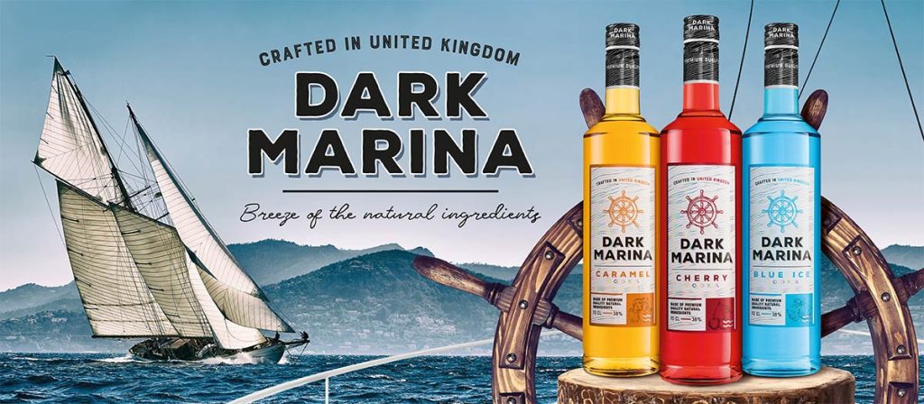
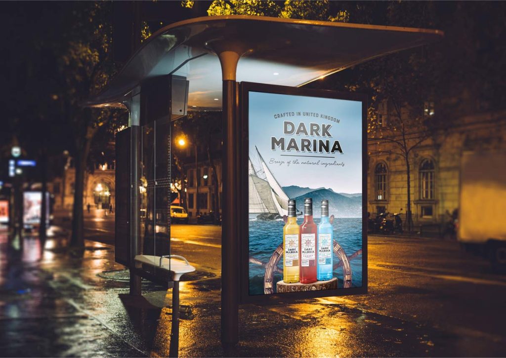
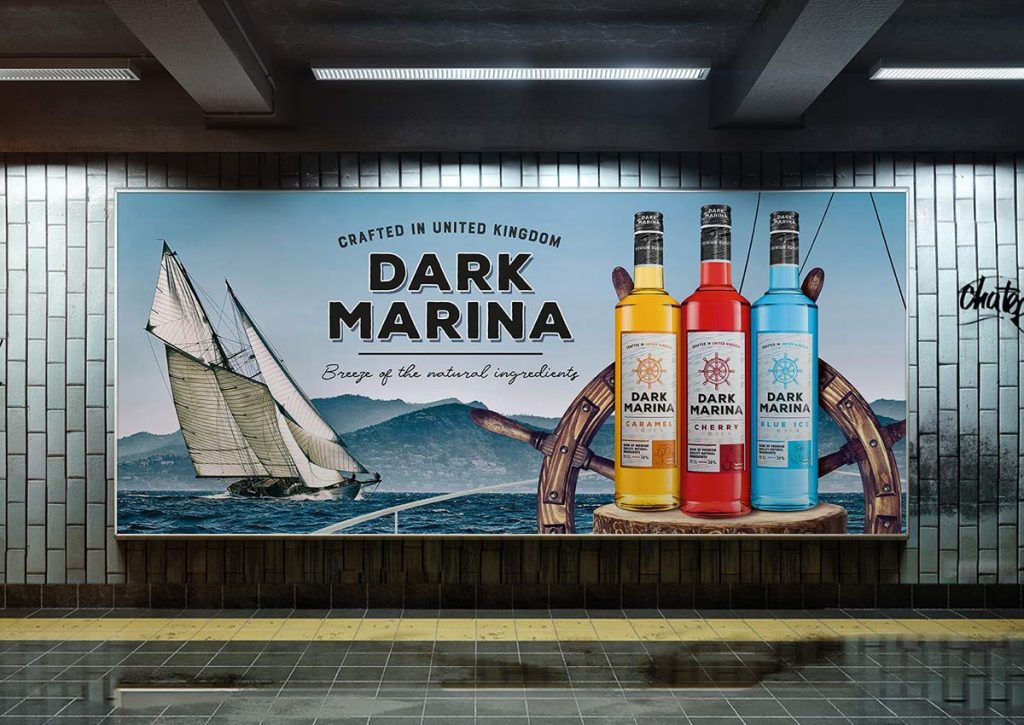
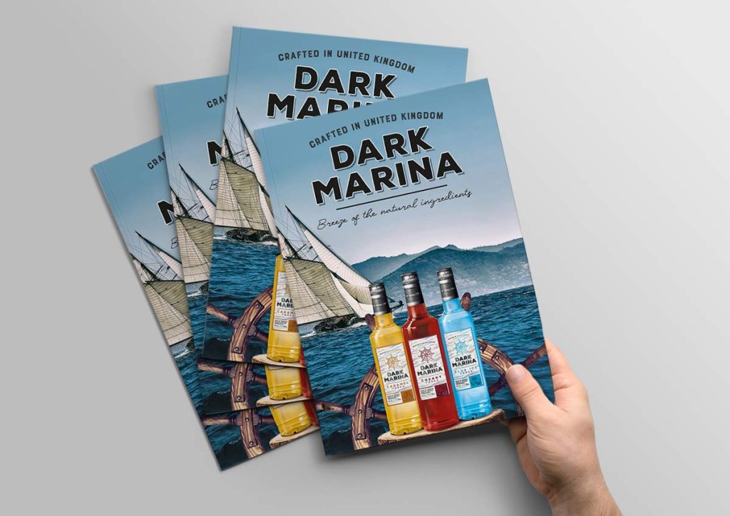
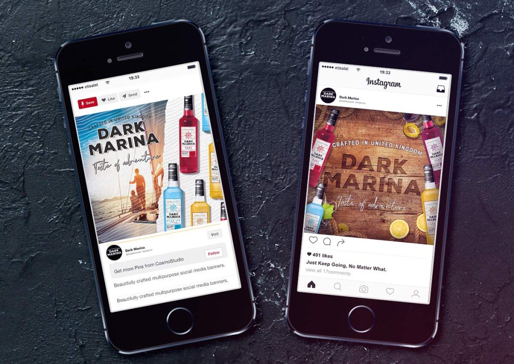
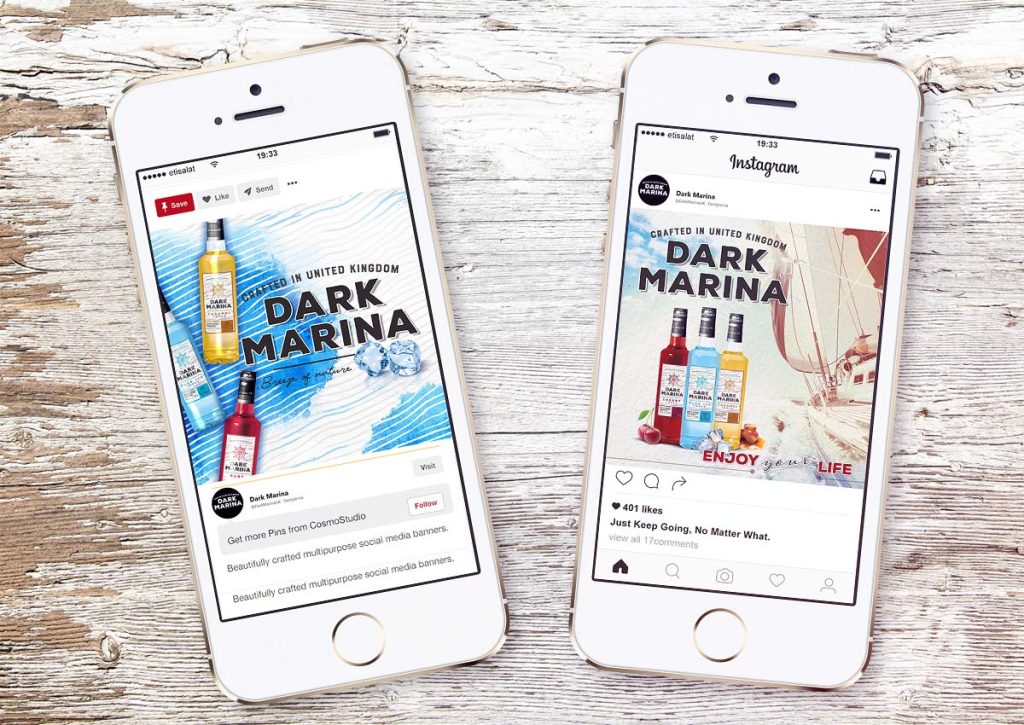
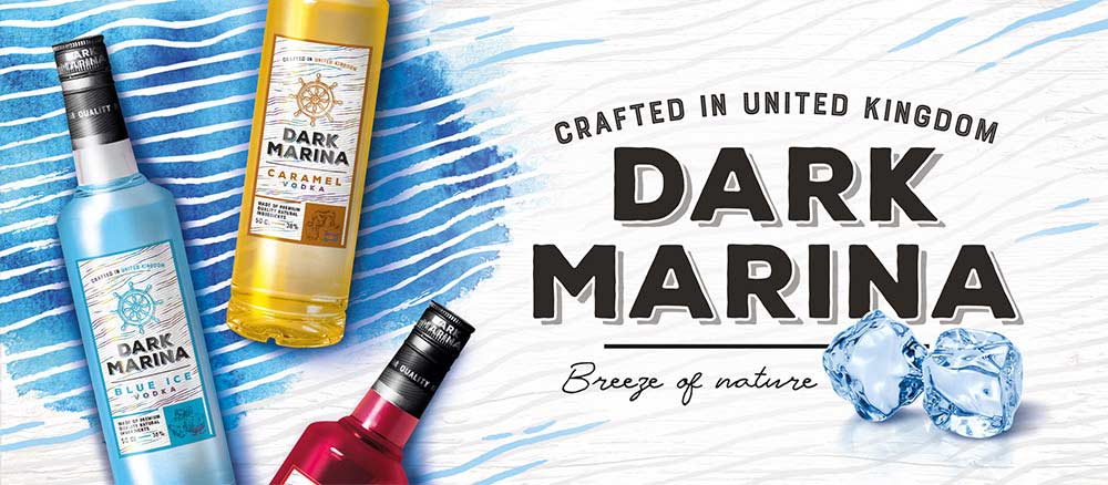
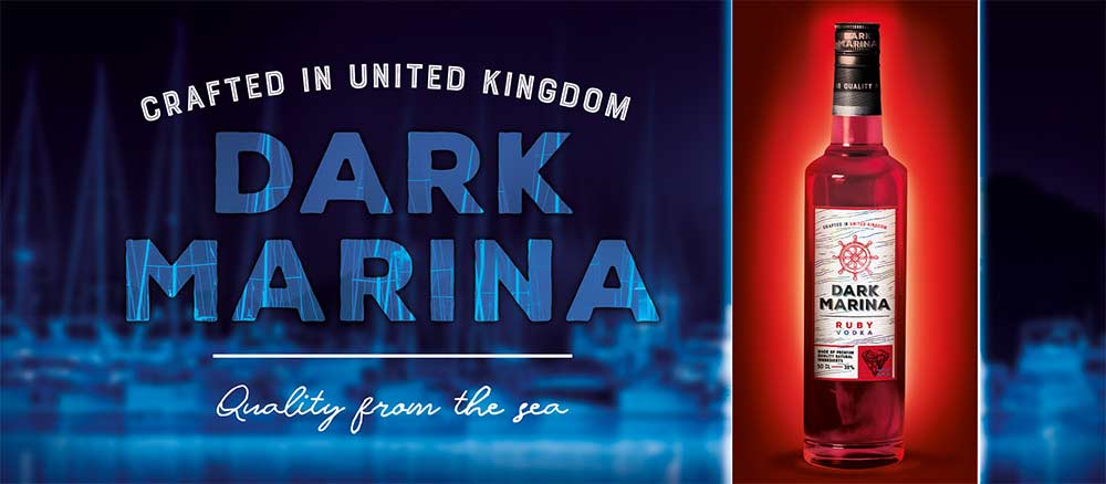
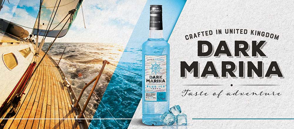
In the meantime, we also worked on a key visual that would be the basis for all further marketing creations. After consulting with the client on various projects, the choice settled on one of them. It was then transferred to other areas of use: posters, city lights, leaflets, catalogs, etc. In the process, we also developed several graphic variants for social media.
Key Visual and its implementation
Designing labels for vodka was not the only thing we made for Dark Marina brand. The whole idea for its later promotion is also important. This is where key visual comes in handy. After its development and approval from the client, we proceeded to implement the KV in various forms: catalog cover, posters, internet banners, social media posts. Additionally, we designed posts that looked different from the key visual because social media promotion is spread over time. Therefore, it requires many different graphic materials tailored to content and the target audience.
–
Let’s make something great together!
Request a free quote.
Contact
Similar projects