Barmańska – refreshing
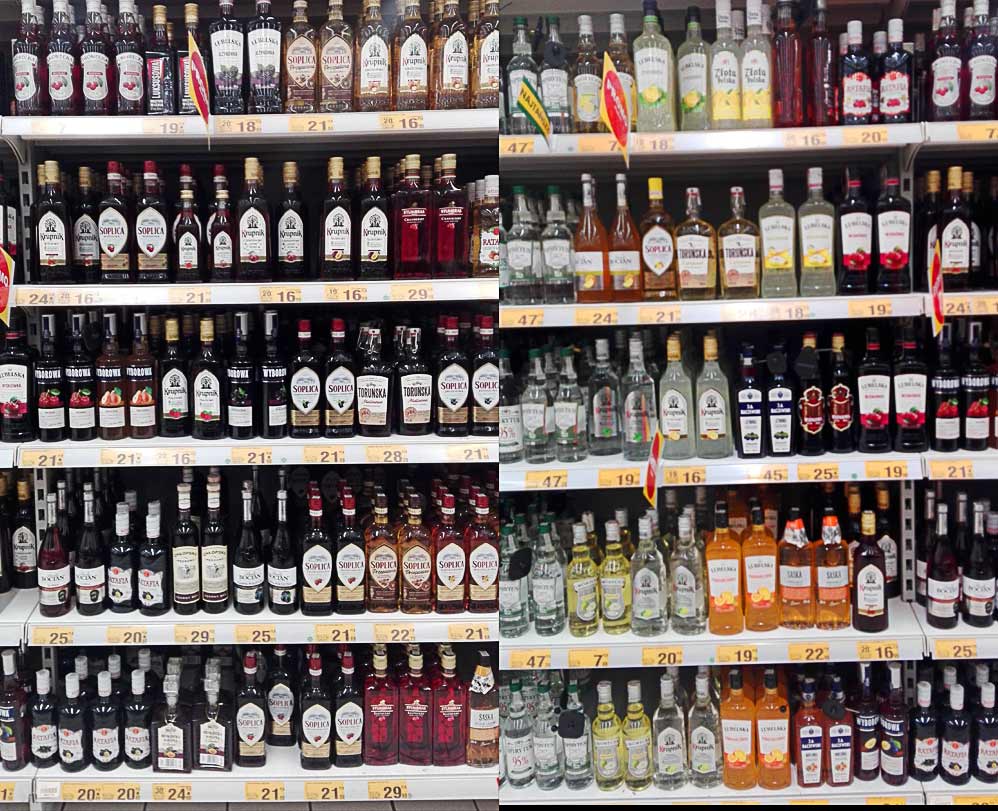
The primary target audience had been high school seniors and first-year college students. However, there was a noticeable decline in the popularity of Barmańska among older college students and individuals beyond that age group. To address this, the focus was on understanding the reasons behind the shift in purchasing habits as customers aged.
Starting point
To find a solution, it was essential to understand the problem thoroughly. What was the reason behind the change in purchasing habits with age? Was it a matter of changing tastes? Consumer research indicated that taste was not the issue; the flavor still appealed to respondents. Was it a shift in habits? Did consumers, as they aged, turn to beers and wines, abandoning flavored vodkas and ready-made cocktails? Again, the data showed that consumption of such alcohols remained at a similar level among the surveyed group. So, was it an issue of alcohol content – not too high, but too low? That wasn’t the case either. The problem was eventually defined.
Problem
Customers associate the alcohol they consume with a specific time in their lives, especially those consumed in their youth. Consequently, they tend to “outgrow” such beverages, not because there’s anything wrong with them, but because they’ve changed their perception of themselves. However, certain brands manage to accompany us through different stages of life. How do they achieve this? Through effective brand positioning, using the right messages, and employing a specific visual language.
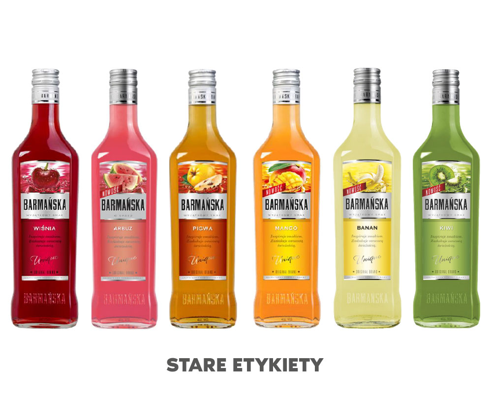
How to change the perception of a particular alcohol? Through new labels. They allow us to convey to customers that the product will continue to be part of their continued fun, parties, and enjoyment of life. While retaining the familiar taste, it will now be characterized by aesthetics that remain timeless.
Action
With the problem defined and the endpoint determined, the next step was to create good designs. Designing labels for alcohol requires experience, knowledge of the industry, and an understanding of the specific characteristics of the product. Given our understanding of the issue, we knew what would constitute a good project. A good design for the new Barmańska label will be:
1. Modern
2. Clear
3. Appealing to both twenty- and thirty-year-olds
4. Time-resistant – meaning it won’t become outdated too quickly

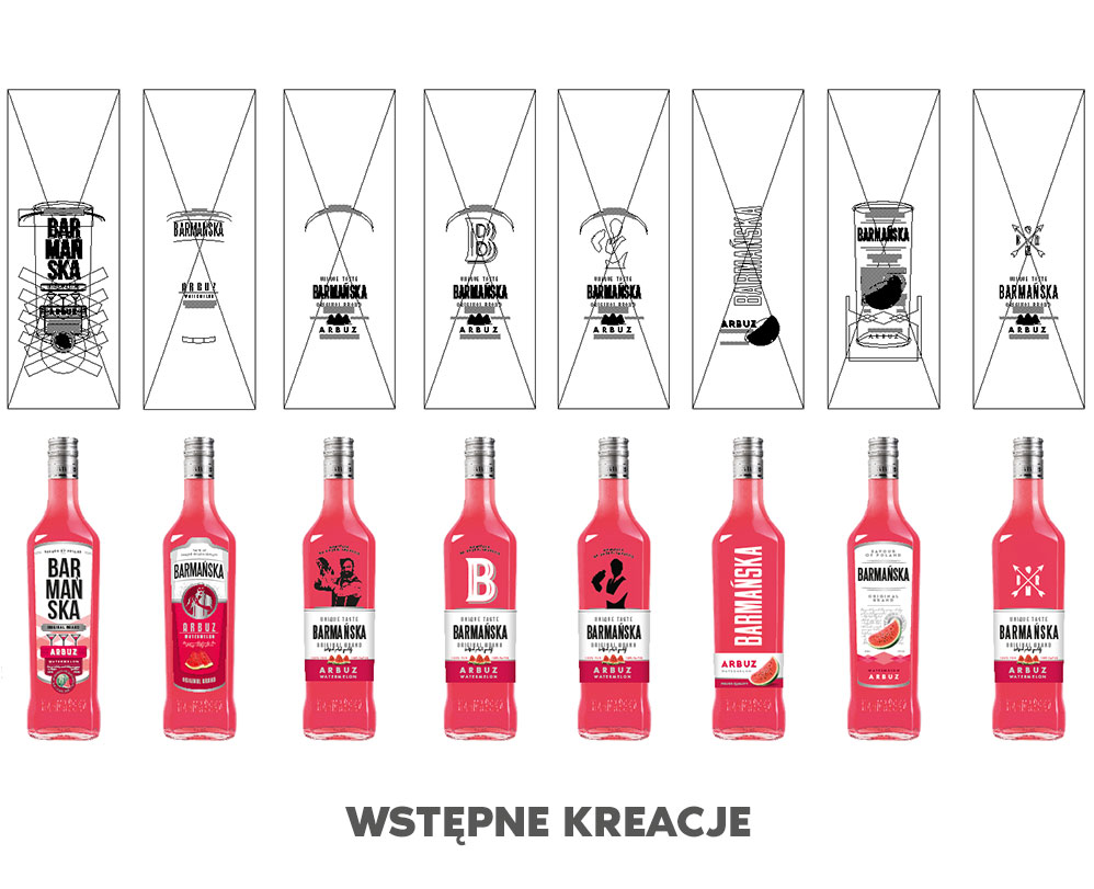
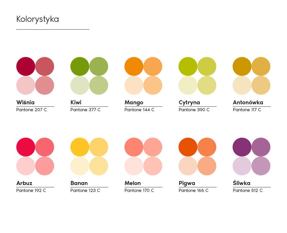
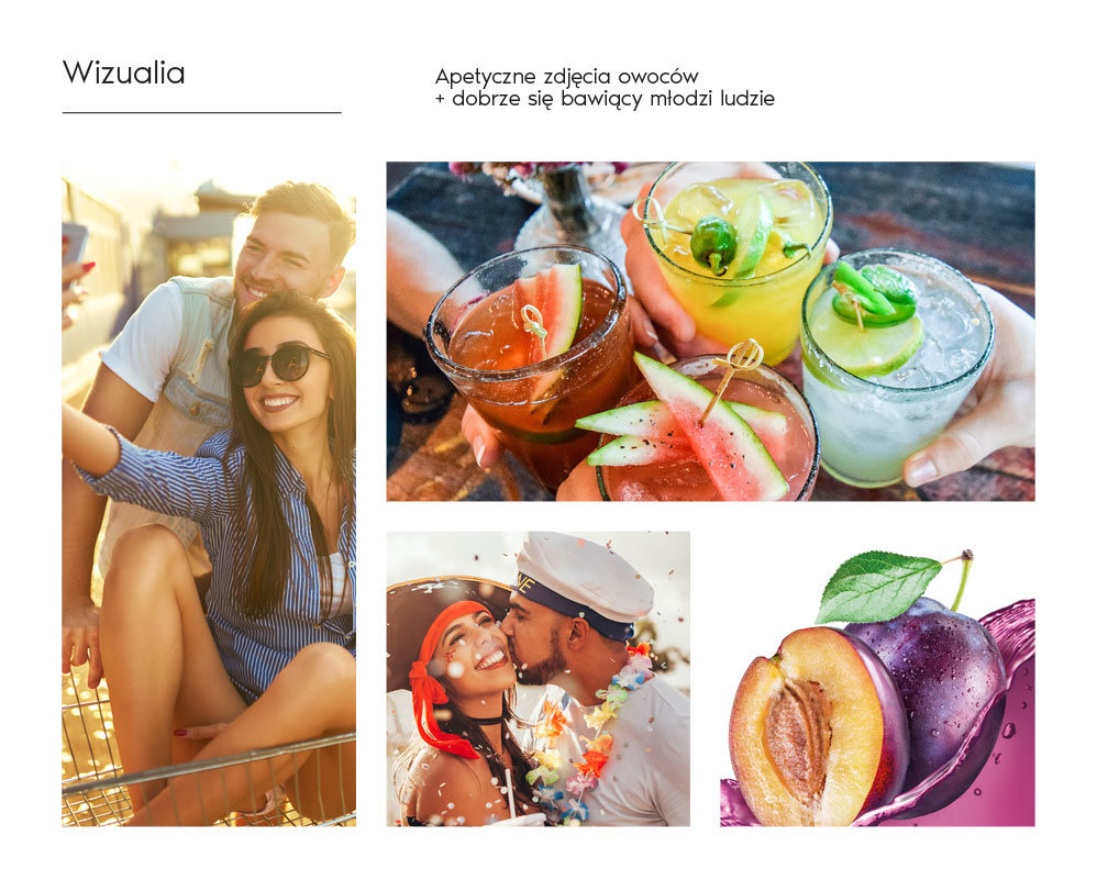
We proceeded to create designs. Initial ideas went in various directions – Bartender? Fruit? Glass? Crest? Coat of arms? After consultations with the client, we settled on fruits, specifically fruits with an appetizing splash.
We stick with the splash
We only need to decide with the client on the exact character of the splash – its density and color intensity.
Larger or smaller fruit pieces?
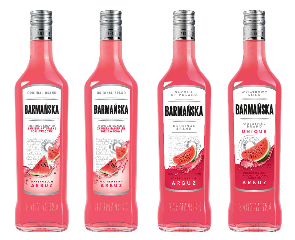
We stick with smaller pieces. Should the splash “hang in the air” or be the upper part of a wave cross-section?
The wave must have color underneath it.
Should the fruit fall into it, slide on it, or float above it?
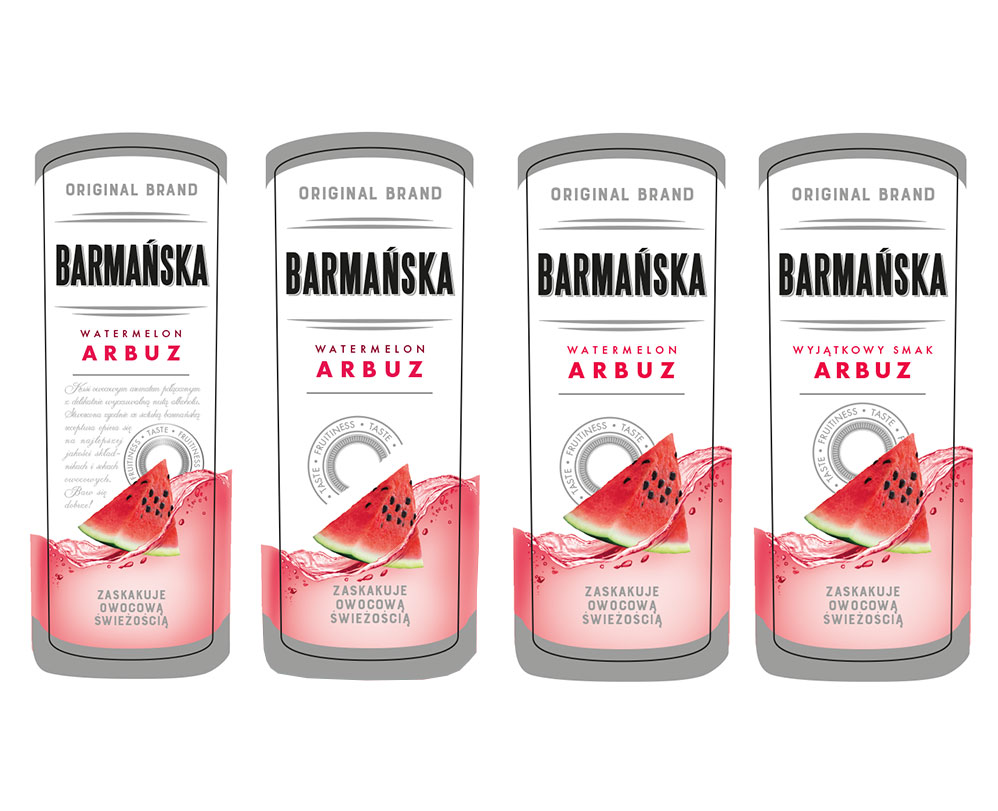
This is it!
We return to smaller fruit pieces, remove the text from the front, and enlarge the quality mark.
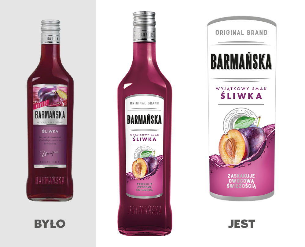
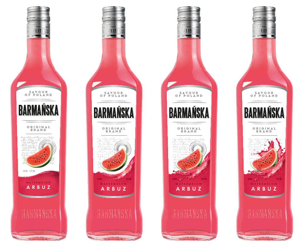
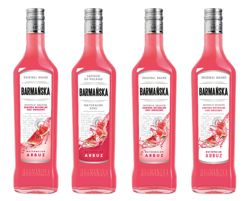
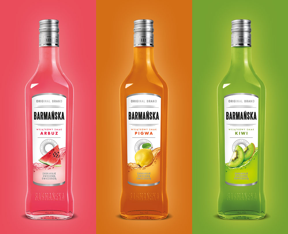
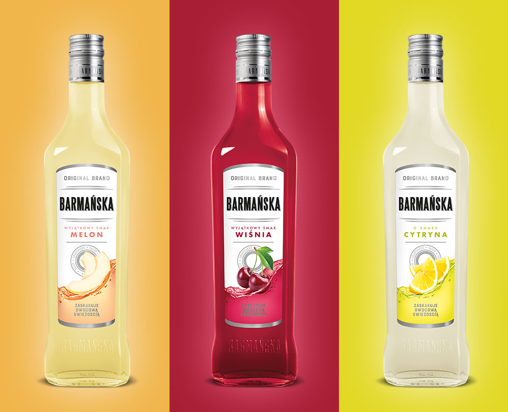
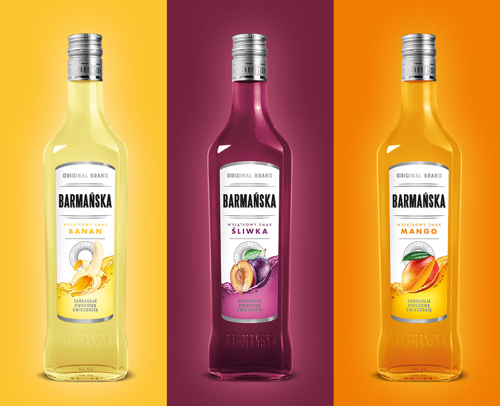
Final result
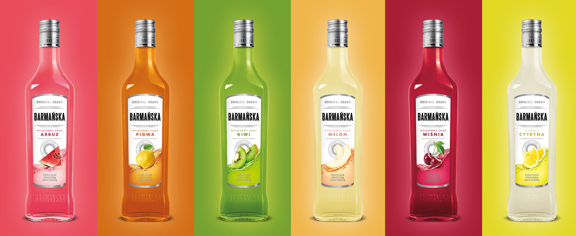
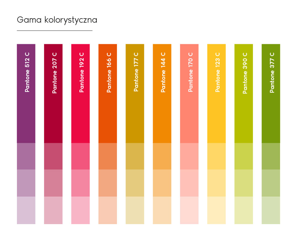
10 flavors, 5 capacities, dozens SKUs, and still growing.

Here’s the entire range of 500 ml bottles.
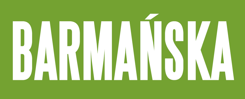
We didn’t just refresh the label, but also the product logo itself
We selected a simple, elegant, timeless font that allowed us to fit the long product name on a narrow label without losing readability.
Let’s make something great together!
Request a free quote.
Contact
Similar projects