Sante – packaging for cereal
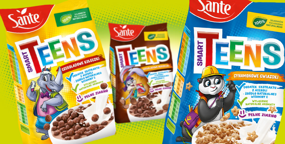
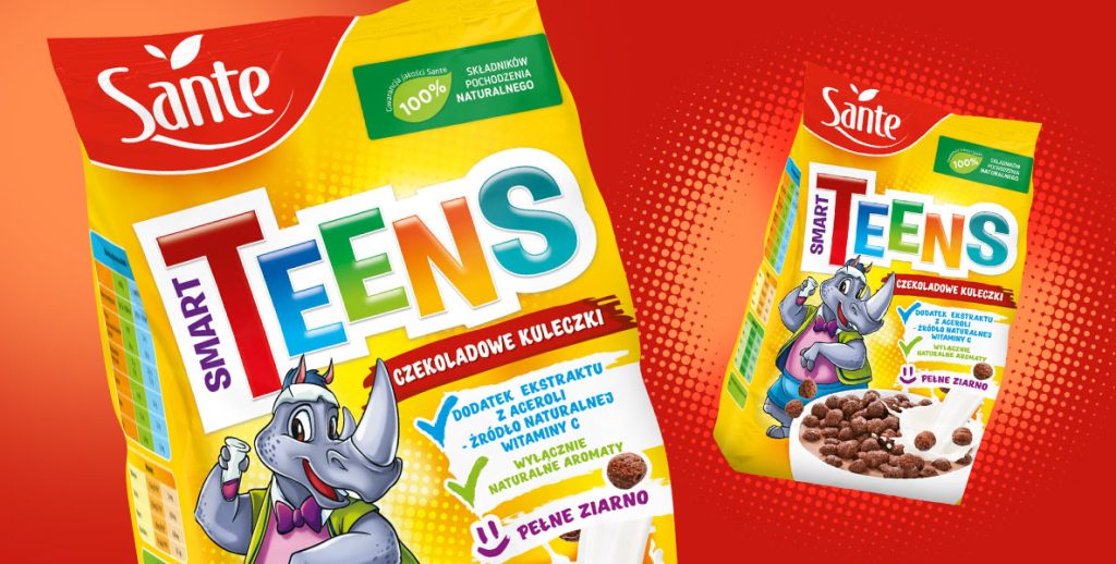
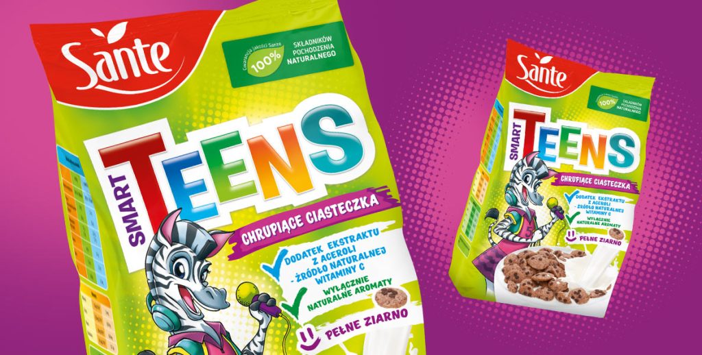
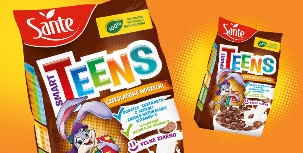
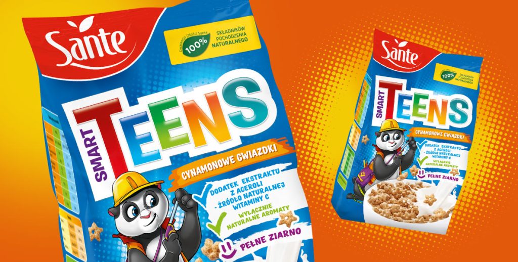
The most crucial change was to replace the photos of children with engaging illustrations of friendly animals. Consequently, the background, captions, and callouts needed to be adjusted. However, the existing Smart Teens logo remained unchanged.
Since the focus of the new packaging was on illustrations, we started by describing our brand heroes. Creating new mascots, we aimed for diversity and tailored them to appeal to a slightly older audience—aged 12 and up, as per the client’s request. The chosen candidates were a panda, rhinoceros, tiger cub, zebra, canary, and bunny. Each character received different attributes related to physical or intellectual activities. This approach drew attention to the product’s main advantage—natural ingredients that are nutritious, healthy, and valuable for both the body and mind. Hence, the series was aptly named “Smart Teens.”
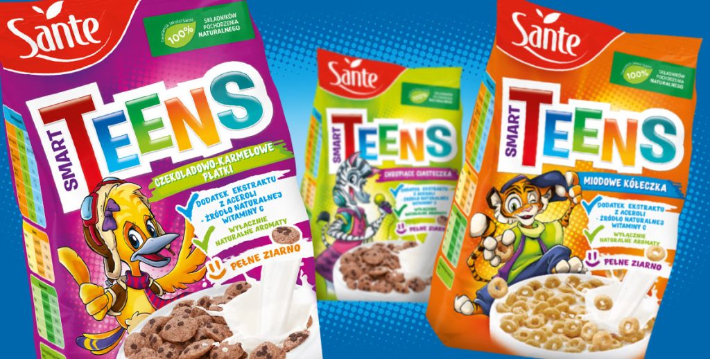
How the Brand Hero projects came to life:
Conceptualization: We began with series sketches, testing various poses, facial expressions, and attributes for the mascots. Should the bunny hold books, or is it better for it to ride a skateboard? Should the canary be a chemist or a pilot? Deciding which attributes suited each mascot was crucial—whether to go for popular and clear associations or swim against the current.
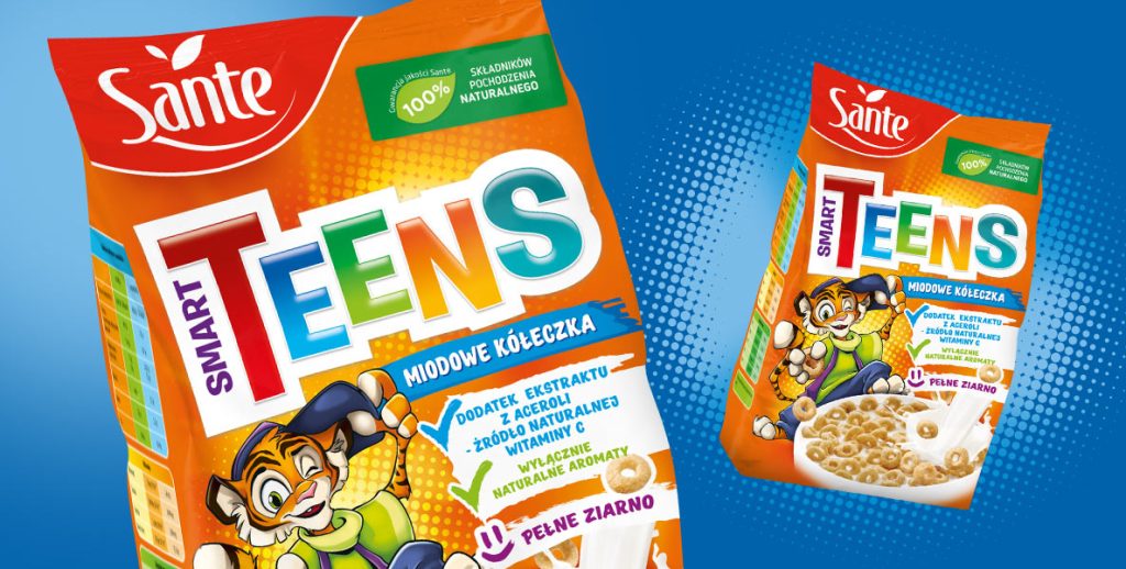
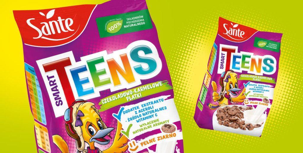
Digitalization: Once we had the sketches, we moved to the computer screen, refining the contours and selecting the best color combinations. However, illustrations alone weren’t enough. To properly showcase them, we had to change both the background colors and existing graphic elements. The same applied to callouts. Thanks to these changes, the Sante-branded breakfast cereals gained a new look. Packaged in these boxes, the cereals now attract the attention of the target audience and effectively boost sales.
Let’s make something great together!
Request a free quote.
Contact
Similar projects
