Pestila – product catalog
Designing the Pestila product catalog – project assumptions
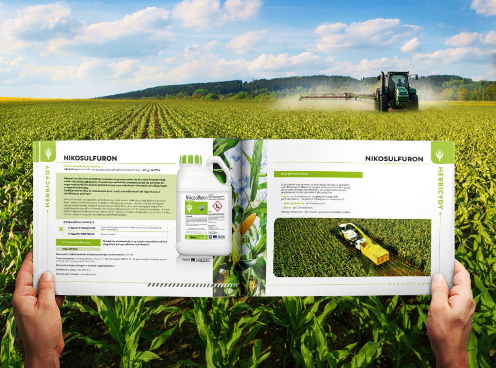
Pestila is a Polish manufacturer of plant protection products. The company approached us with a challenging task: to create a catalog for their products. There were two main challenges: a tight timeline and the need to design a clear project that would be visually attractive yet precisely showcase all the essential features of the products.
Due to the tight schedule, there was no room for extensive exploration and testing of different layout solutions for the catalog. We had to present a well-thought-out and functional solution right away. When creating the first spread, we had to anticipate potential issues that might arise on subsequent pages of the catalog and prevent them from causing delays in the project’s delivery for printing.
Challenge
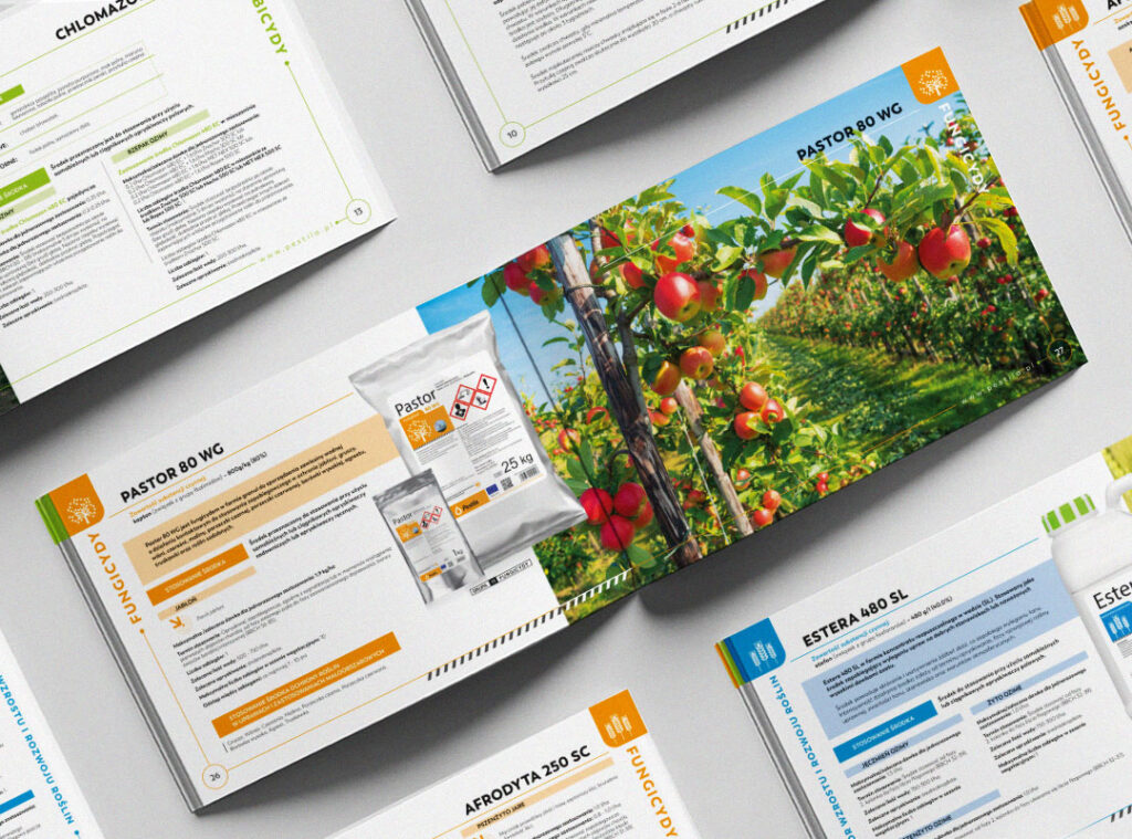
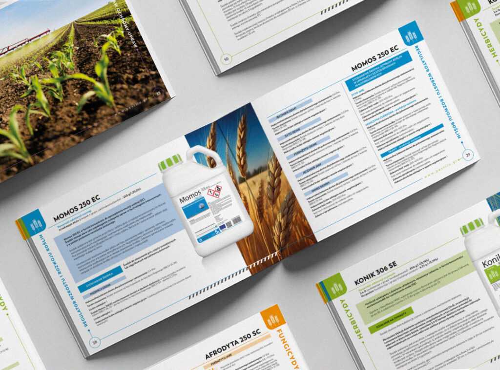
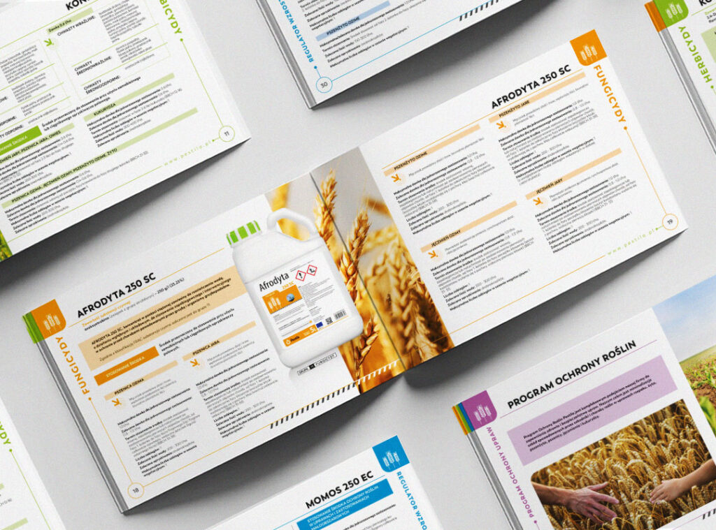
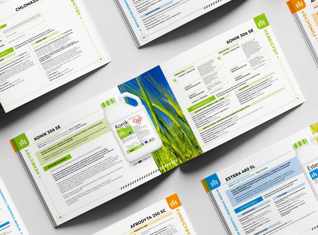

The second challenge was that each product differs slightly in its application. We have herbicides, fungicides, growth regulators, and developmental regulators. The question arose: how to maintain consistency while showing the differences between them?
Such products require a large amount of legally required content, which must be included in the catalog. This results in the ‘wall of text’ effect, where the recipient is overwhelmed with so much information that they cannot read it all. Moreover, in this text overload, they struggle to find what is truly important to them.
Because the products have different functionalities, we couldn’t create a fixed grid or table to display product features. Each SKU has a different scope of action, and individual text sections have completely different lengths. Therefore, we had to create a flexible yet cohesive system for presenting content.
Creation
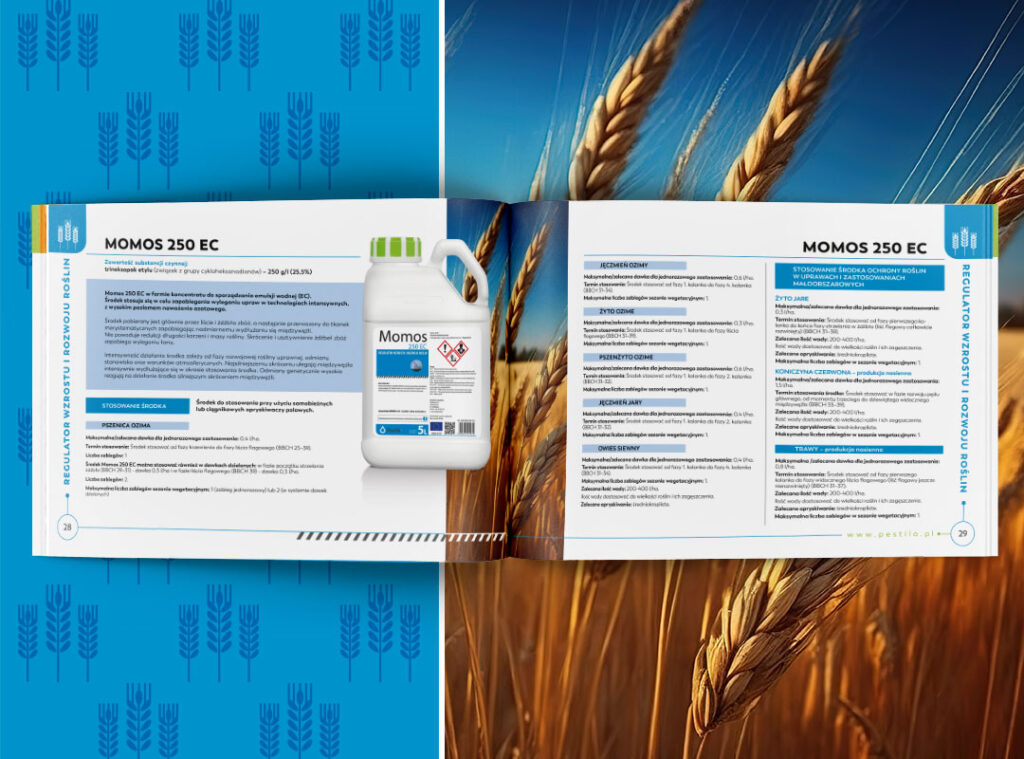

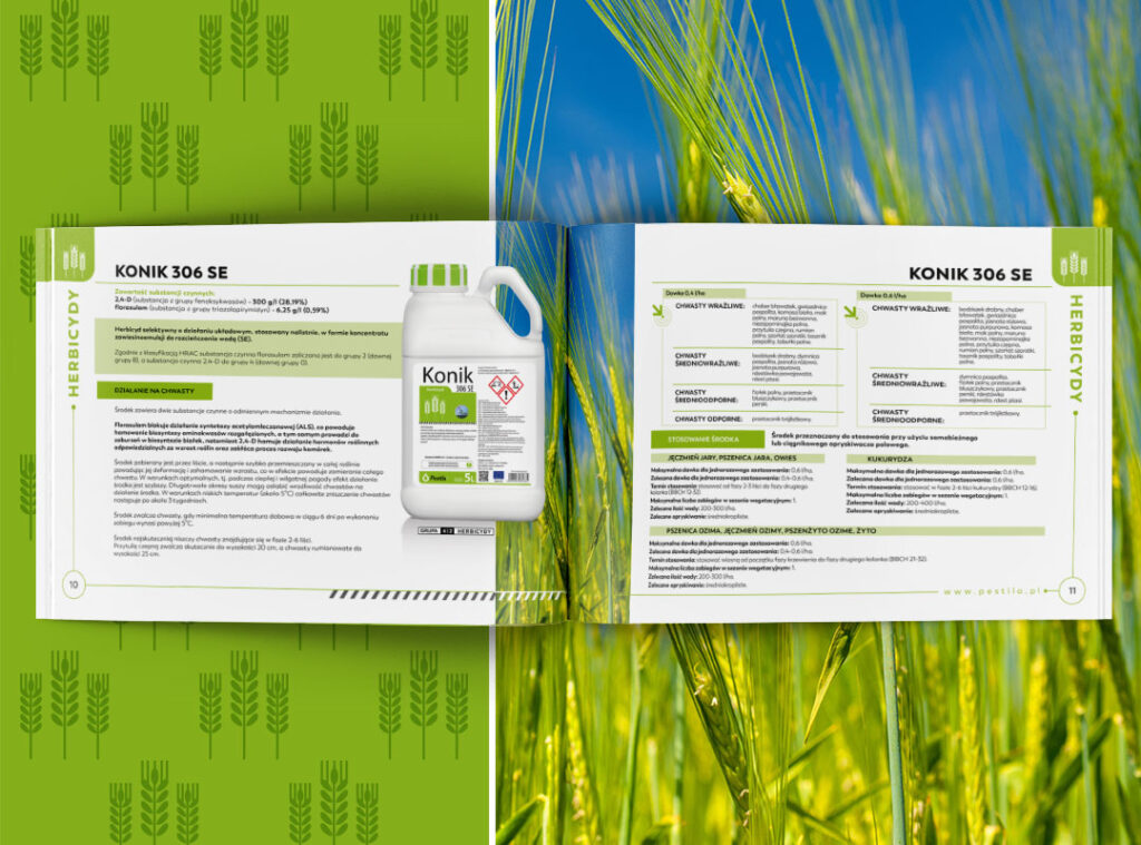
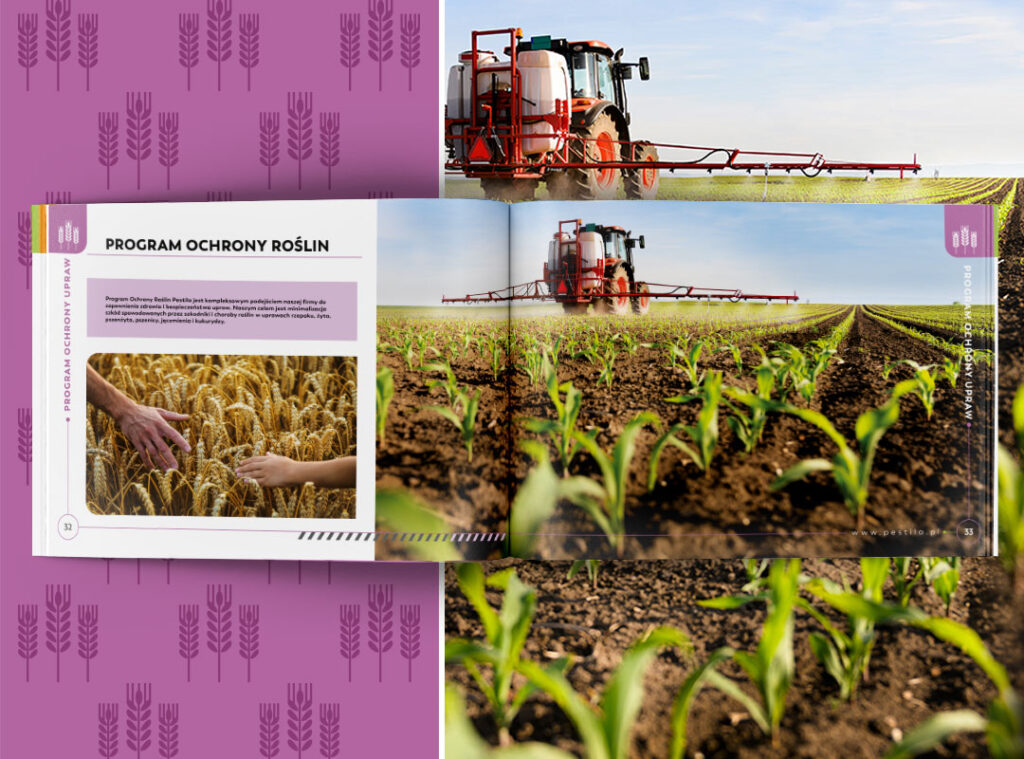
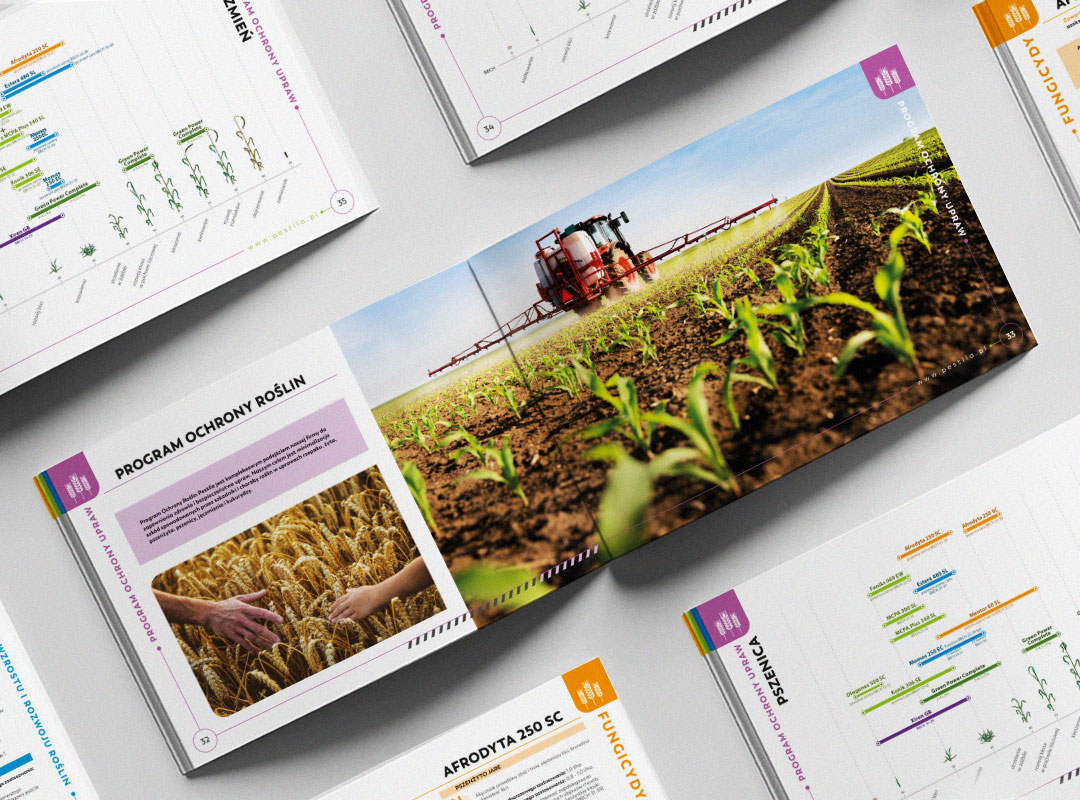
Due to the specificity of the products and their specialized descriptions containing essential information for the audience, we had to propose an engaging and interesting way of presentation. Such a challenge required an individual approach to each spread. The effort paid off because, instead of a wall of text, we achieved an attractive visual form that did not overshadow the content.
The final result
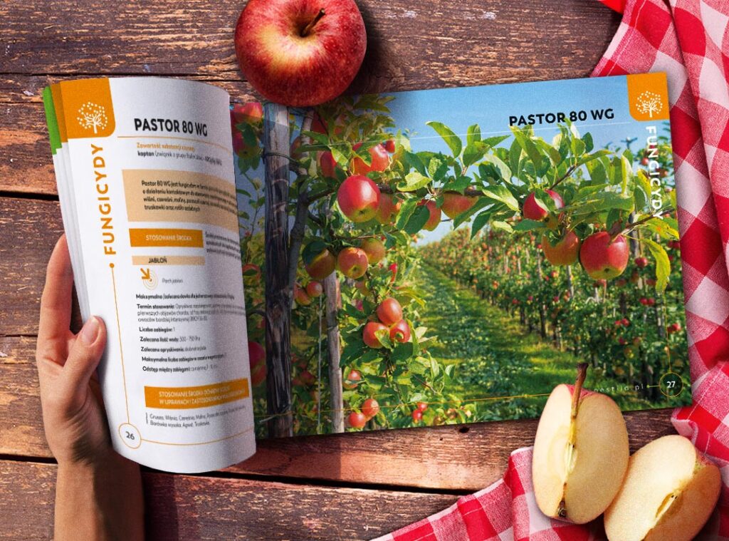

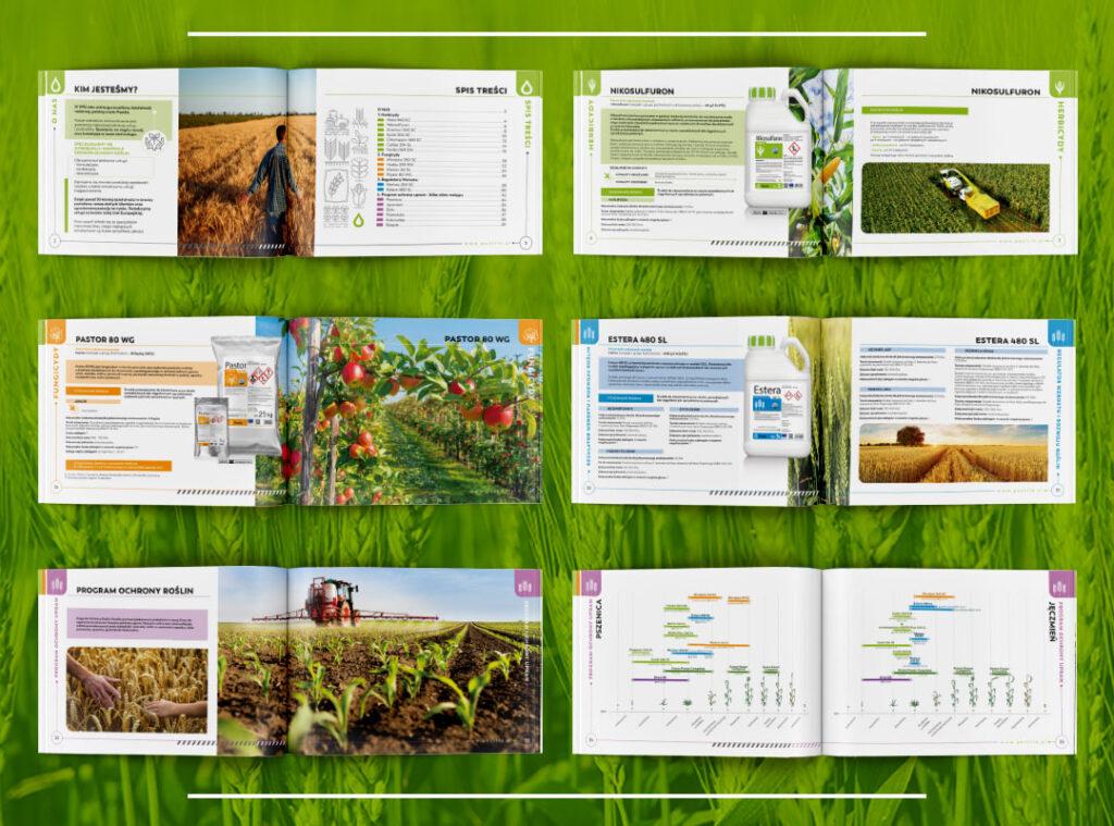
Thanks to simple means of expression, cohesive color scheme, and elegant, minimalist typography, we created a catalog that is consistent, clear, and most importantly, readable for both customers and traders.
An additional touch is the modern icons, which serve as visual counterpoints and highlight important texts. A crucial elements of the catalog are carefully selected plant photos – they create a harmonious background for pack shots, perfectly complementing the content of each spread.

Let’s make something great together!
Request a free quote.
Contact
Similar projects

