Neutrea – cosmetics branding
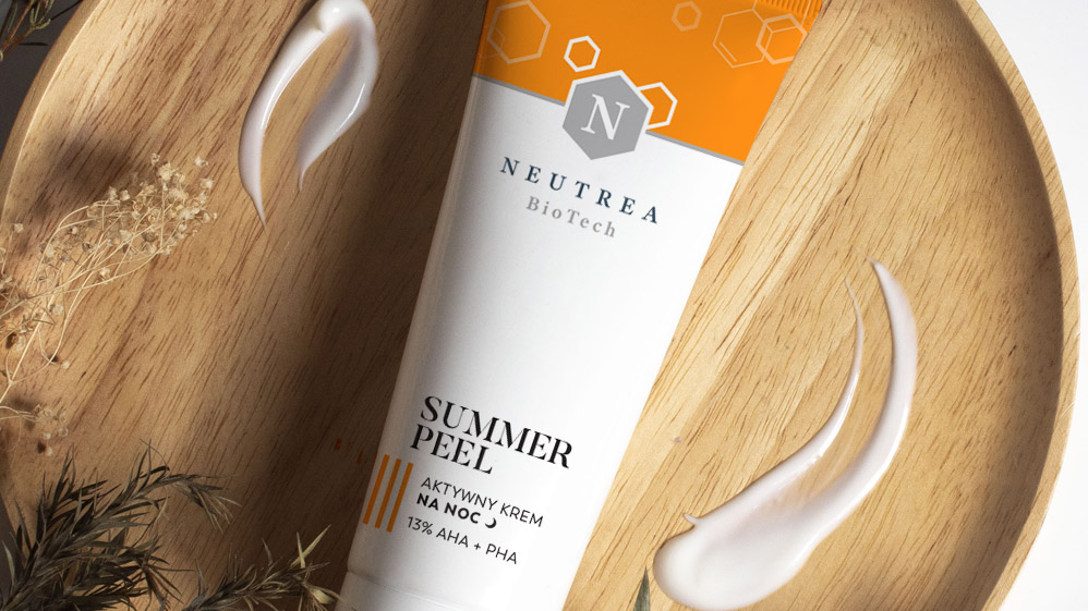
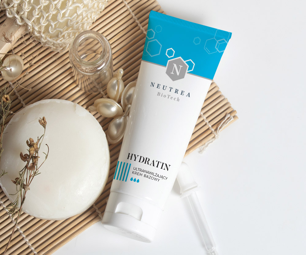
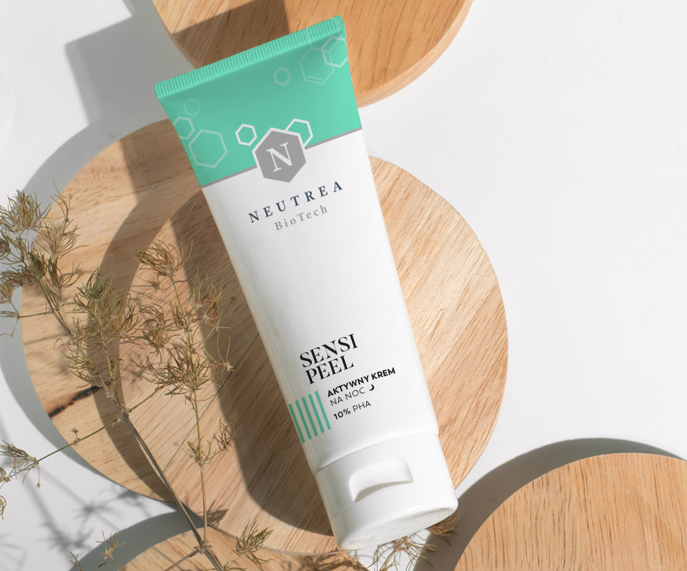
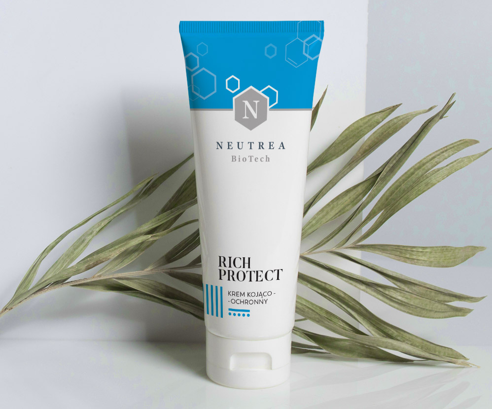
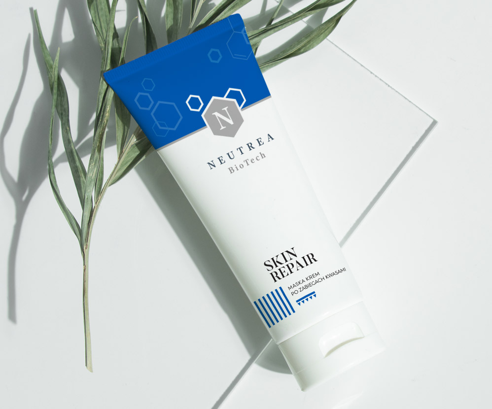
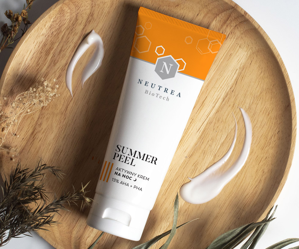
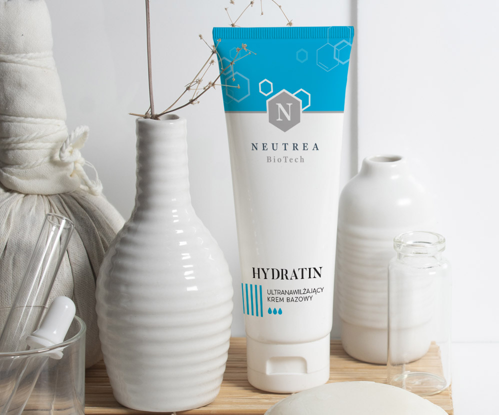
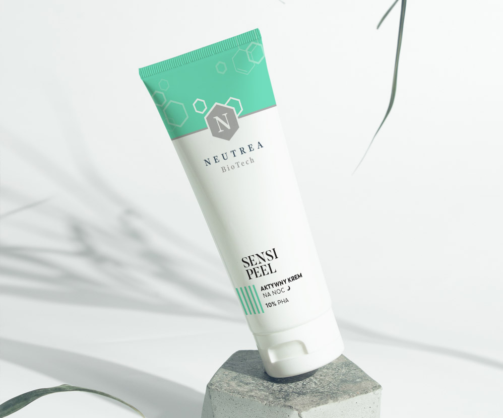
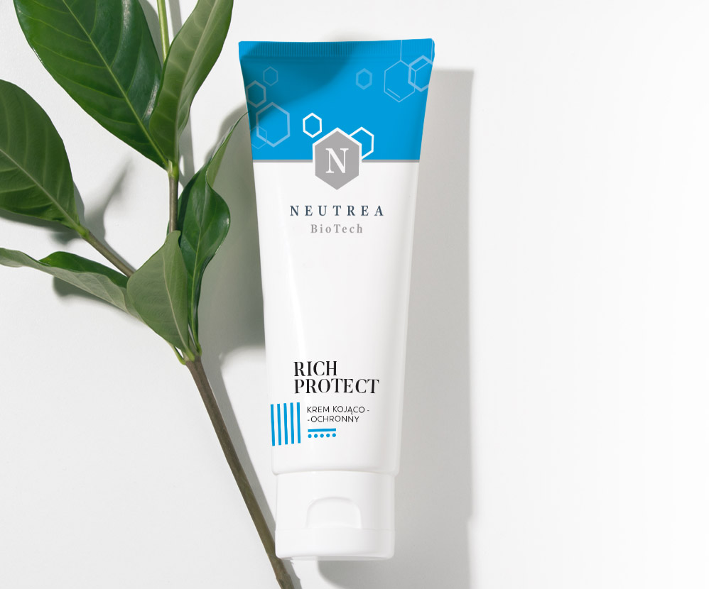
Soon after, we also designed packaging for other cosmetics, including Rich Protection, Sensi Peel, and Skin Repair. Our task was to refresh the packaging to make it modern and appealing while maintaining a connection with the previous designs. It was important to preserve the existing composition and minimalist character. Designing Neutrea cosmetics packaging meant working within strict guidelines.

Brand logo design
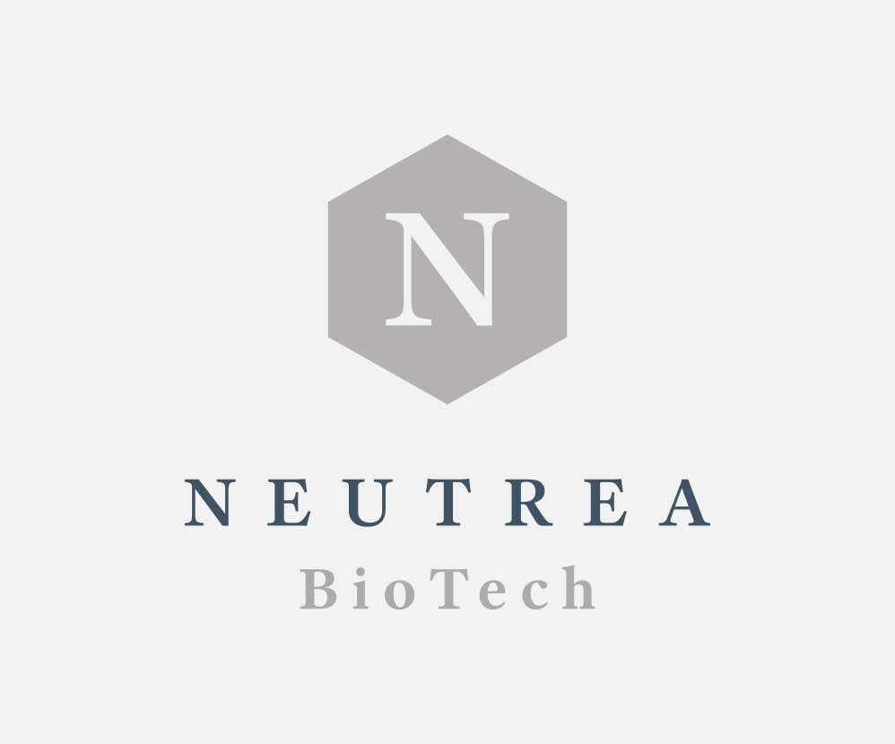
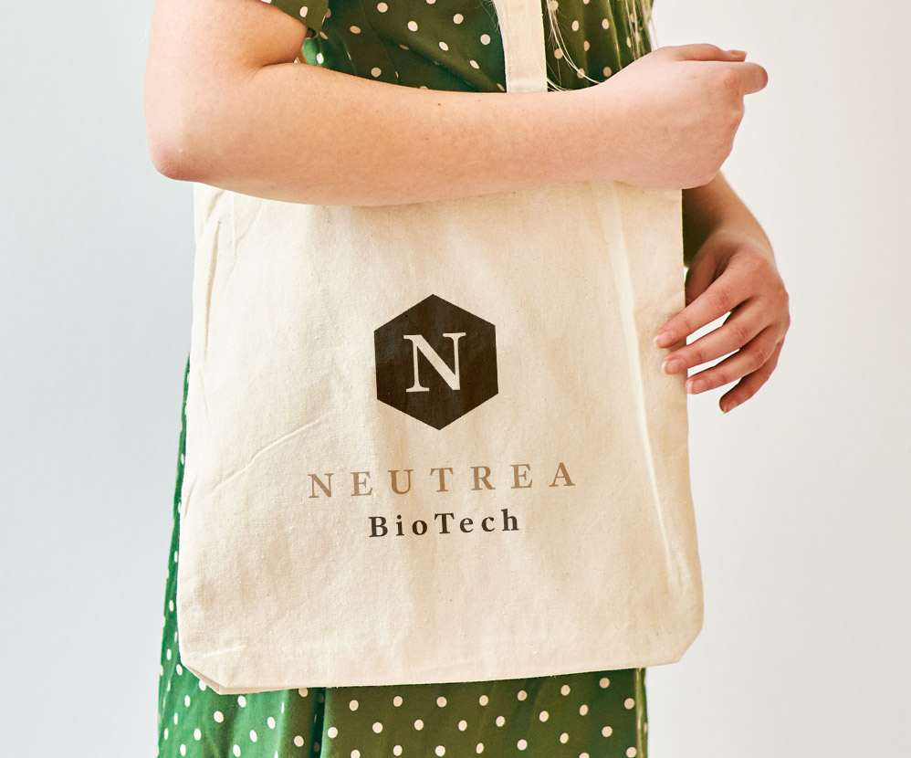
The work also included designing the brand logo. We refreshed it slightly to better align with the new packaging. However, in line with the guidelines, we maintained a connection with the existing symbol. This way, we breathed new life into the Neutrea brand, simultaneously enhancing rather than completely changing its image. Such an approach to refreshing packaging projects is crucial for us. It results in gaining new customers without losing the existing ones. Working on an established brand in the market requires delicacy. It’s easy to go overboard, create something completely new, but in doing so, lose part of the existing customer base. We’ve detailed this process in an article for the Pharmaceutical Industry World.

Let’s make something great together!
Request a free quote.
Contact
Similar projects
Novascon – dietary supplements packaging
