Kazbek Peak – wine label design from Georgia
Task
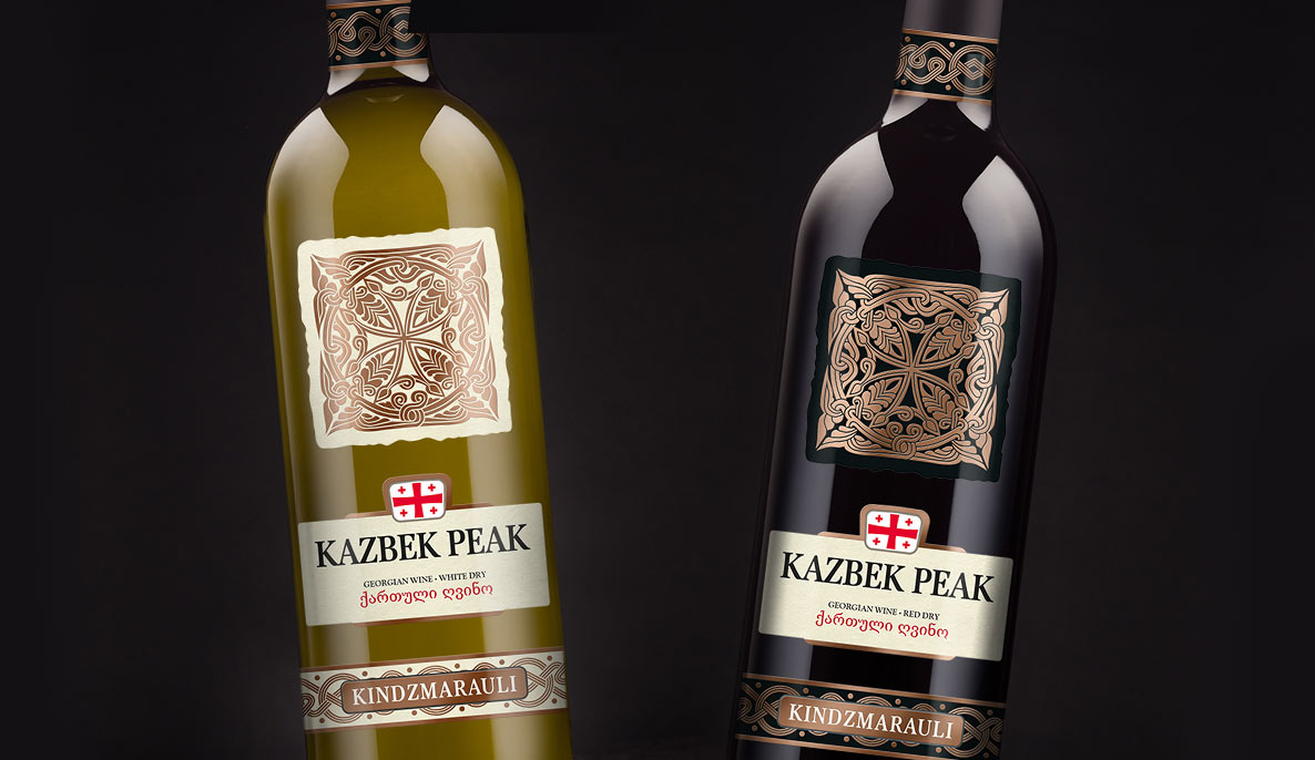
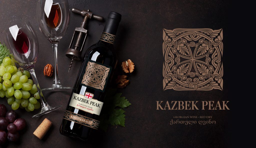
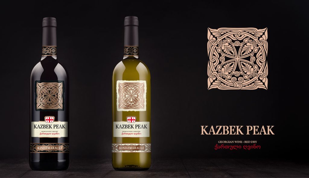
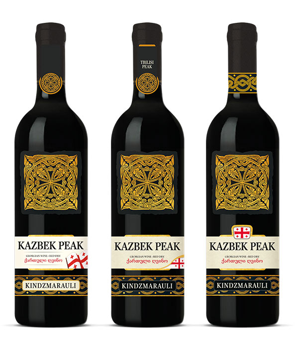
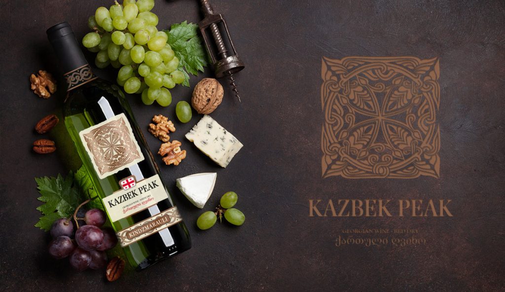
When collaborating with the wine importer Partner Center, we didn’t have extensive experience in designing alcohol labels. However, we felt wholeheartedly that it was an industry we not only wanted to explore but also one in which we would have a lot of interesting things to say. Above, we present the final result, and in the following part of the entry, we show some behind-the-scenes materials, a kind of case study of the entire process, and what the final wine label designs look like.
Analysis
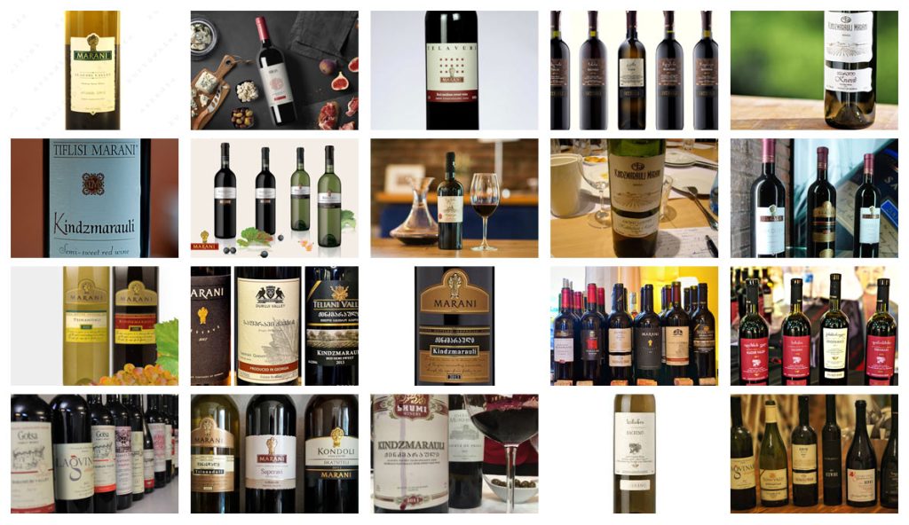
We began our work by analyzing the competition – as seen in the summary of our research above. We looked at dozens of labels from Georgian wines and hundreds of labels from other regions. Later, we started learning about the history and specifics of the region to anchor our project in Georgia’s tradition and culture. Both for us and the client, it was essential for the label to be connected to the Caucasus. Therefore, we approached sketches and concepts from historical, geographical, and cultural perspectives. Above, you can see a compilation of some labels present in the market that we analyzed, discussing their strengths and weaknesses. This helped us have a rough idea of what we wanted to achieve in our label designs for the Georgian wine, which, at this stage, did not yet have a specific name. Hence, the random jumble of letters in the illustration next to it.
Process
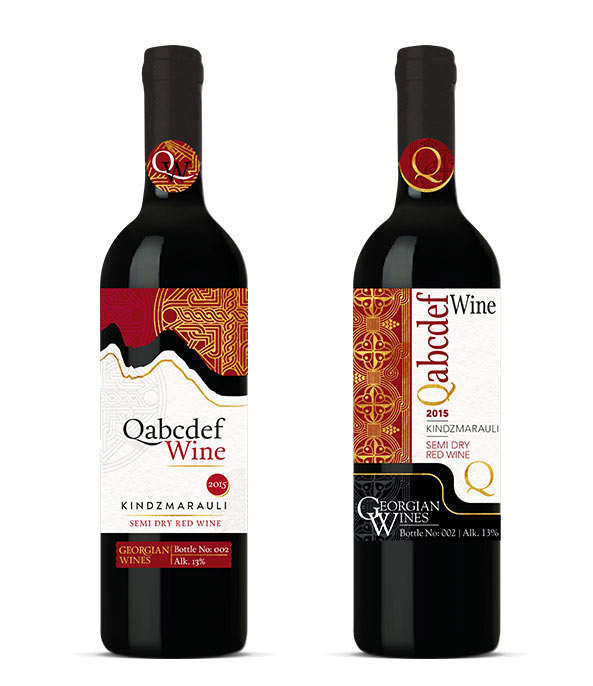
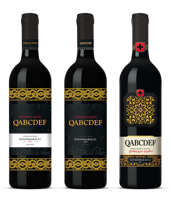
Firstly, we attempted to recreate the mountain line, making it the upper part of the label, as seen in the illustration above. We complemented it with gold accents reminiscent of Caucasian ornaments and connected it with a noble burgundy color. In the next creation, we opted for a more pronounced display of ornaments, making them a key element of the label. The name was written vertically to distinguish the wine on the shelf. The second group of initial designs focused on a different ornament, darker colors, and embossed gold accents. Eventually, the red cross of St. George, the patron saint of Georgia, appeared as a subtle accent emphasizing the origin of the wine at first glance. This design was selected as the most interesting, and we began refining it.
Details
or, how wine label designs come to life
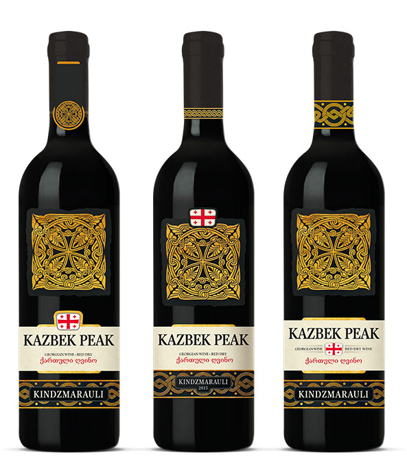
And so the time came for refining the details, as seen above. We considered various options for placing the flag of Georgia, not only in terms of its location on the label but also in how it was presented. The final result can be admired below.
Let’s create something great together!
Request a free quote.
Contact
Similar projects
Wine label design for Sabat Wine – Celtica Vineyard
