JNT – wine label design
Taranaki Bay
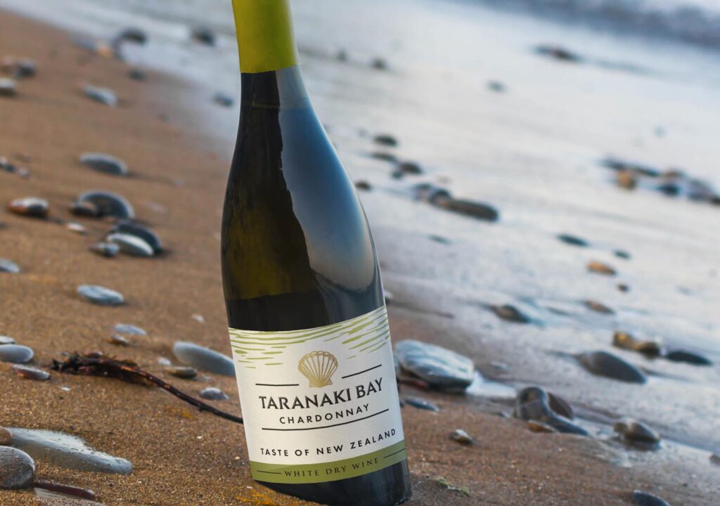
Taranaki Bay is a wine straight from New Zealand. The guidelines for designing the label for this wine were clear from the beginning – the client needed a modern creation. From several names proposed by us, he chose Taranaki Bay. We offered him various graphic motifs to choose from, among which the shell received the greatest approval. We prepared a modern drawing of a shell, with a delicate motif of waves or ocean ripples. The whole design is in green and gold colors suitable for white wines in this category.
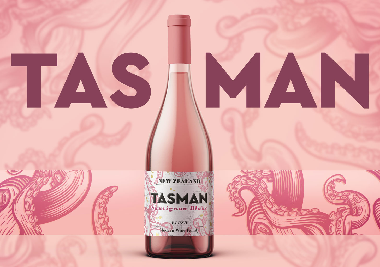
Tasman

Tasman is one of our favorite projects. Simple, distinctive, expressive, and modern. We created this New Zealand wine from scratch as a brand: we came up with the name, logo, and style. Thanks to its unconventional graphic design, the wine stands out on the shelves and catches the eye. A tangle of ferns surrounds the label, remaining delicate and subtle at the same time.
Golden Leaf
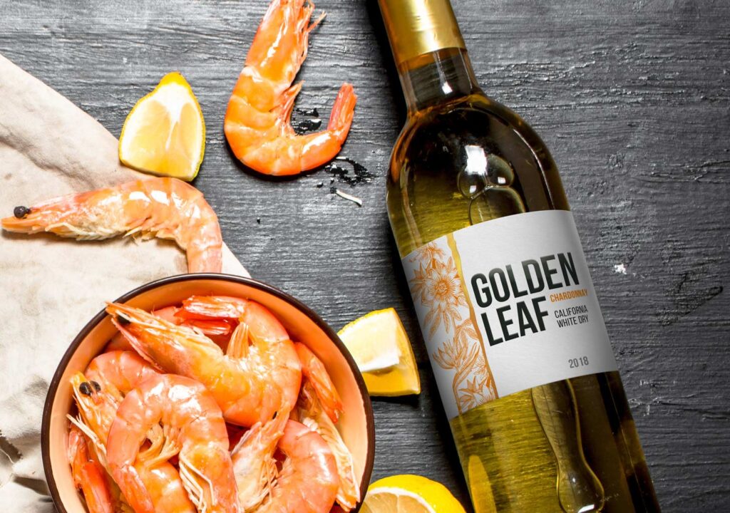
Golden Leaf is a light, white wine straight from sunny California. We aimed to create a name and label design that would be as light as the wine itself. That’s why the project features so much white and strong, yet non-dominant typography. Complemented by an attractive and unobtrusive illustration. Thanks to the vertical division and vertically applied hot stamping, we achieved a rather unusual composition that distinguishes this wine from the competition.
Silent Lamb
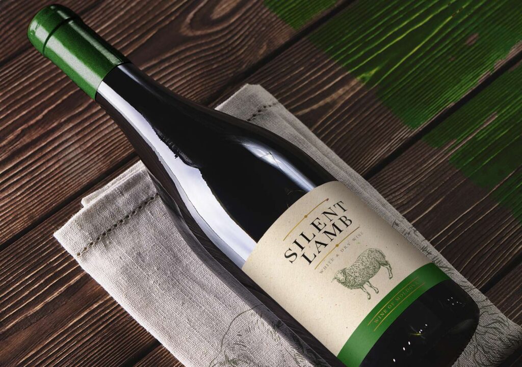
Silent Lamb is a Moldovan wine for which we developed a complete branding: from coming up with the name and theme, through typographic logo, to label design. Following the client’s request, we aimed for simplicity on the border between modernity and classicism. Hence, there are few graphic elements on the label of this wine. In addition to the illustration of a lamb, we have only small graphic ornaments in the form of lines. Serif fonts prevent this project from veering into modernity, imparting a slightly classical feel, which has been our goal from the beginning.
Mauve
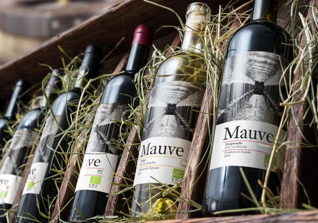
“The label design for Mauve wine was also a comprehensive process, including naming, searching for graphic theme, logo, and, of course, label design. We delve into the interior of a Spanish cellar filled with aging wine. Classicism blends with modernity here. We have serif fonts and a theme of a wine cellar with barrels, but it is broken by the use of a photo that gives a barely perceptible, modern twist. Additionally highlighted with a Bio certificate on the front of the label.
Bagieniec Vineyard
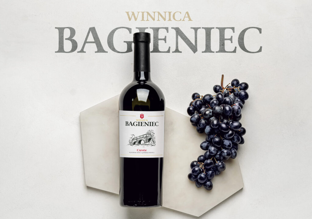
Bagieniec is a Polish vineyard that, around 2020, produced wine commissioned by JNT. Our goal was to connect the label with the place of origin, which is so essential for most Polish vineyards. A characteristic local landmark is the manor complex dating back to the 16th century. The manor on the island can be reached by crossing a charming stone bridge, which we chose as the main motif for our label. We created an original engraving for it, added lettering, a stylized coat of arms, and appropriate typography. The label was printed on craft paper with a deep texture, emphasizing the originality of the place of origin and the character of the wine itself.
Melora di Sotto
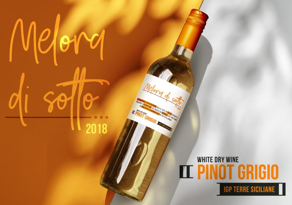
Designing labels for Melora di Sotto wines involved a comprehensive scope: coming up with a name, designing the product logo, creating a theme, and crafting the label. This modern label for Italian wines is characterized by an almost complete absence of graphic elements. Its main focus is typography – a combination of handwritten scripts with sans-serif, modern fonts. The entire design is centered around words because they are crucial when describing the taste of this wine. How else to depict its flavor if not through words?
Seashell
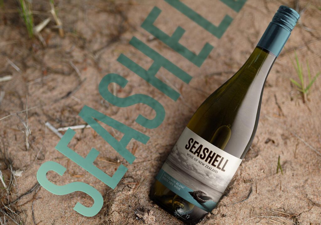
Over the course of a few years, Seashell sought its identity twice. We were present during both of these processes, assisting the project from its inception. The first version of Seashell, which hit the shelves around 2020, featured modern typography and a photograph on the label. At the bottom of the label, there was a colored strip, different for each wine. The minimalist color palette and clever use of the colored strip made the shell at the bottom of the label extend beyond the frame, giving the whole design a slightly three-dimensional taste.
Seashell Blush
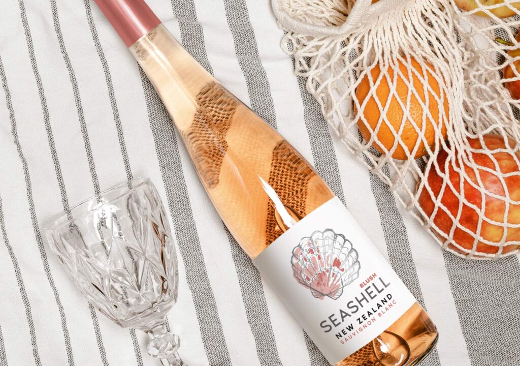
The latest version of the Seashell Blush label places a strong emphasis on the shell motif, resulting in an overall more minimalist design. The typography stands alone without any embellishments, and the illustration features solely the shell. This approach allows us to highlight the wine’s fresh character without explicitly stating it. Sometimes, the simplest means are the most effective.
Abalone Shore
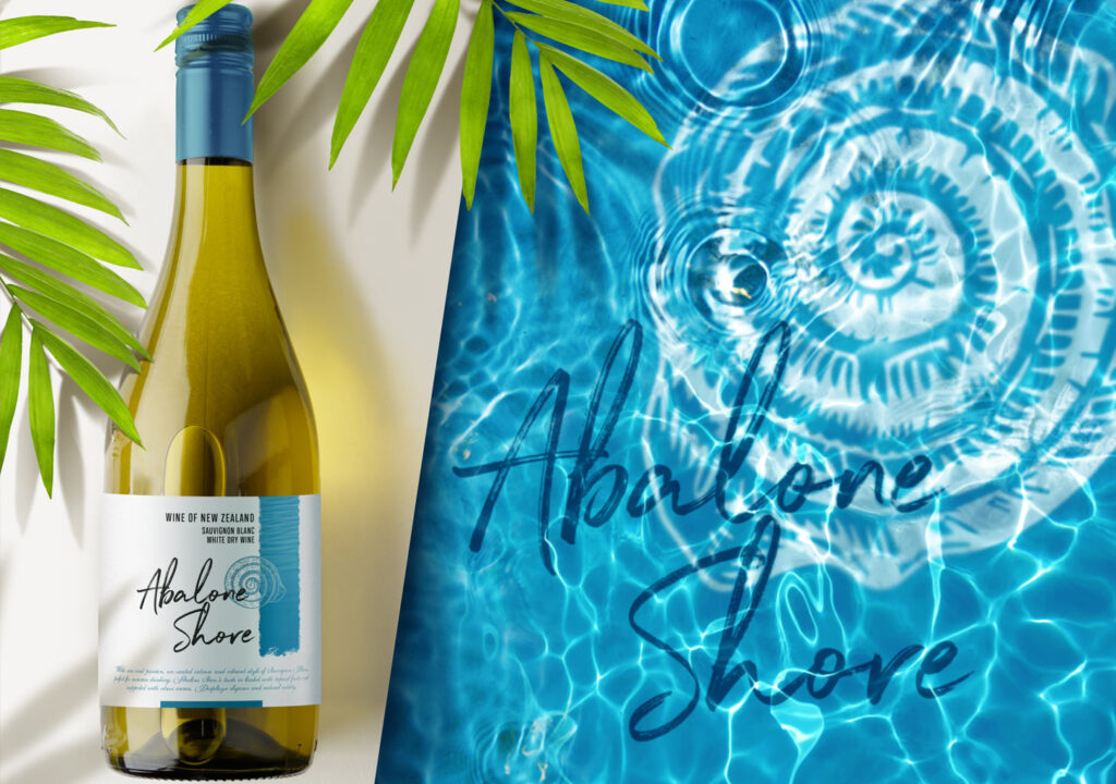
Abalone Shore is a New Zealand wine for which we designed a modern label. It includes everything that immediately brings to mind wines from the New World. Modern typography, a non-classical composition, an interesting formal feature in the form of a vertical strip printed using metallic Pantone. On it, we printed an illustration of a shell, additionally coating it with a matte varnish to enhance the contrast between these two elements.
Nulu Rock
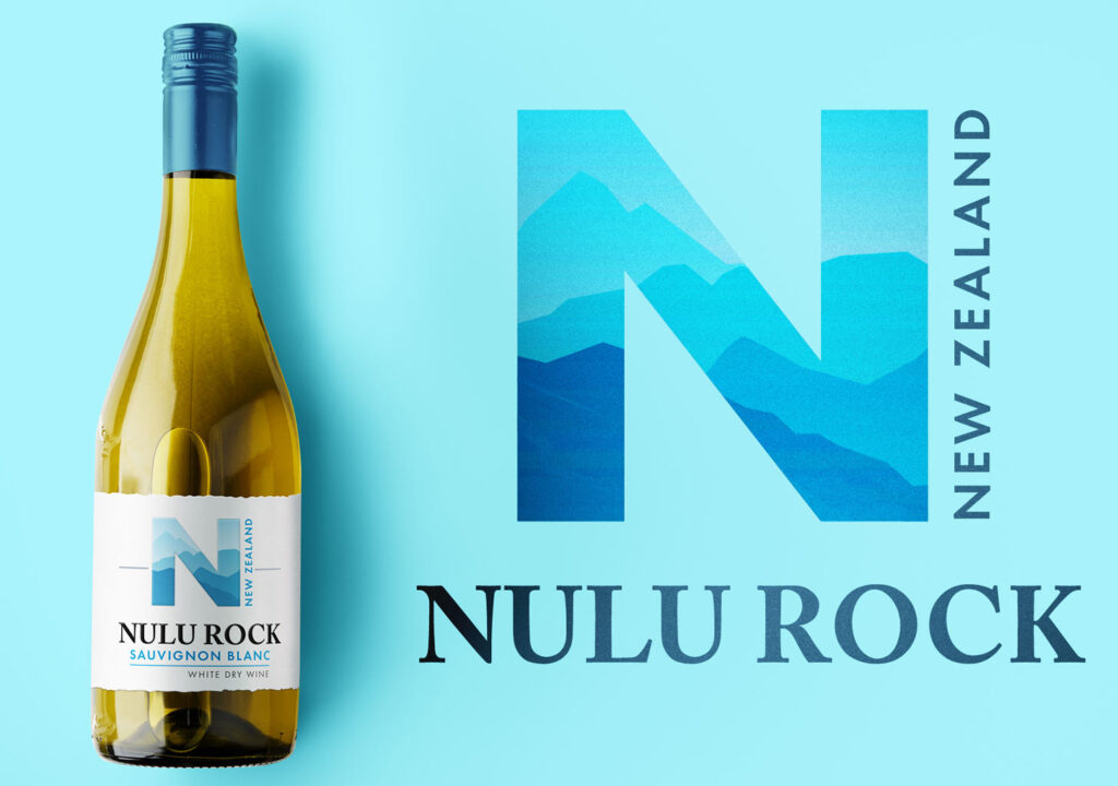
The next representative of New World wine is Nulu Rock. This time, the label design was to focus on the large letter N, into which we incorporated the outline of the New Zealand landscape. The whole is complemented by an irregular, as if manually torn shape of the label and relatively modern typography. The illustration is simplified, capturing the character of aerial perspective. This refers to the classical painting technique, suggesting that more distant plans are increasingly brighter, as if blurred.
Pukao
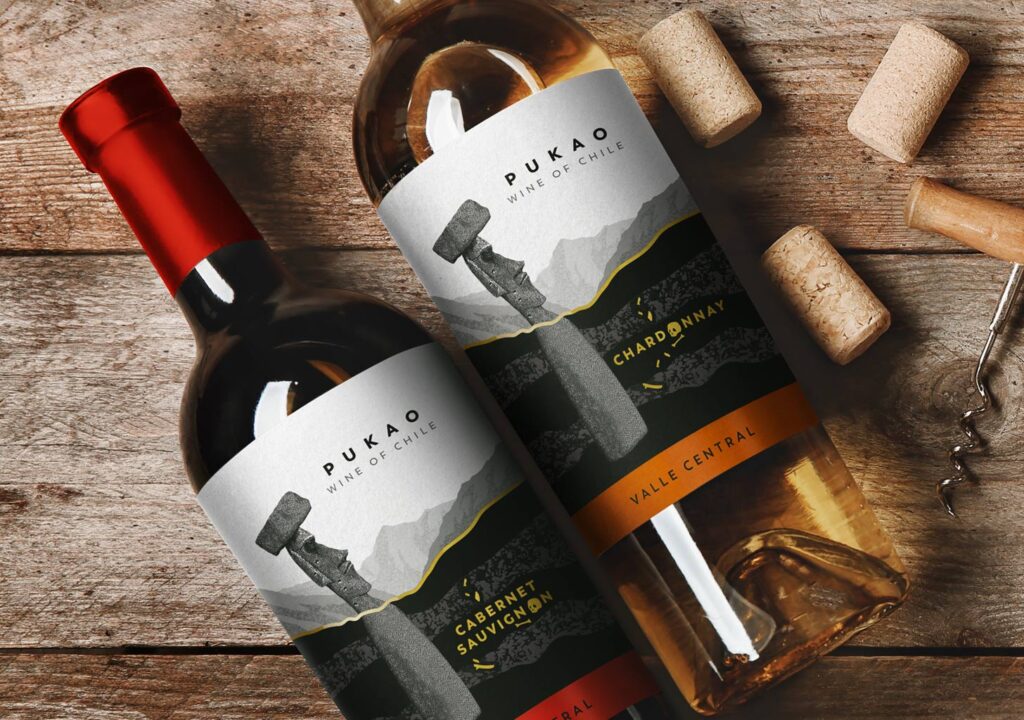
Pukao is a wine from Chile. The label concept created by us included naming, graphic motif, product idea, and logo. In terms of typography, we opted for minimalism, choosing a not too large product name. However, to bring it to the forefront and increase readability, we gave it what is known as ‘breathing space.’ This means that we did not place any additional graphic elements around the name itself. As for the visual message, our intention was to show sculptures from Easter Island, both those on the surface and those below it. An additional touch is the illustration of bones underground. To add even more surprise to this, this element is printed as golden hot stamping, and the letter O in the grape variety is replaced by a skull!
Cantemiri
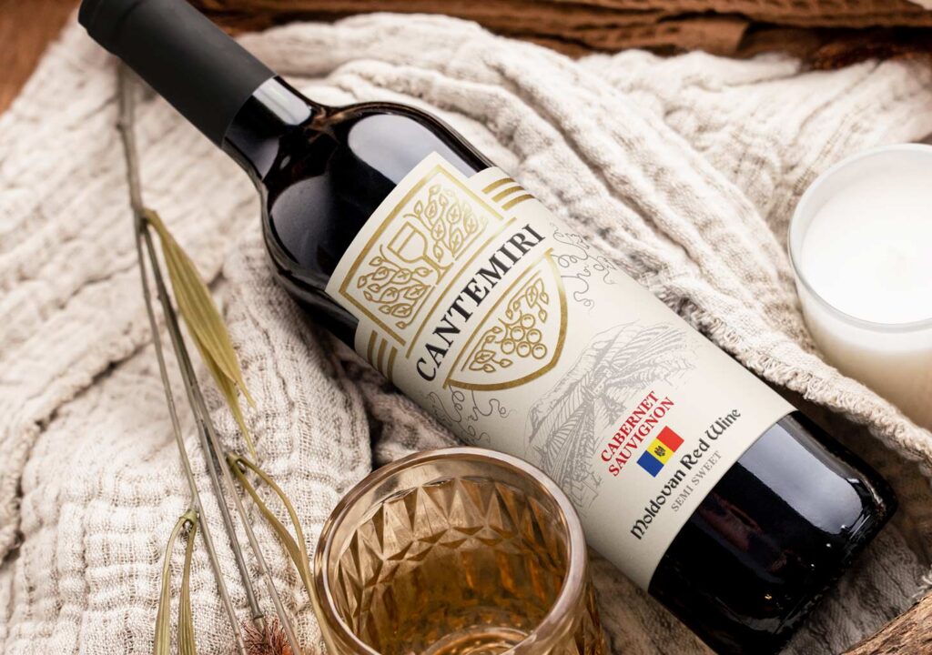
The label for Cantemiri wine represents a classic-modern concept for a product originating from Moldova. It features a classic vineyard engraving and typography combined with a modern coat of arms and embellishments. The design includes a relatively large flag of the country of origin, making it clear to consumers which region the wine comes from.
Rustaveli Avenue
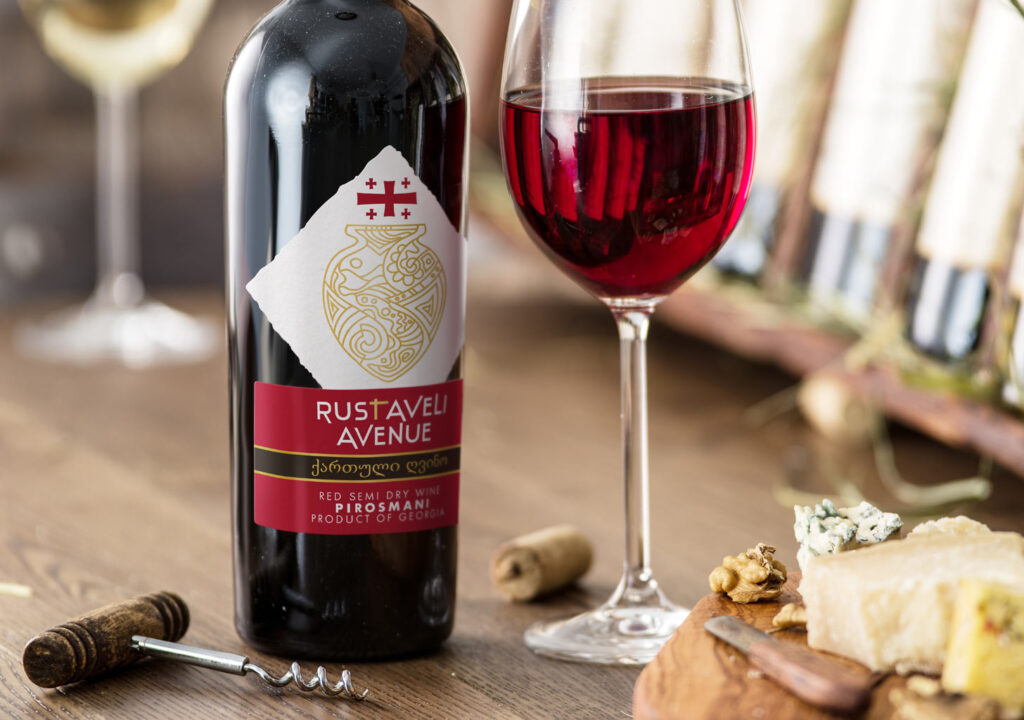
Rustaveli Avenue is a Georgian wine with the theme of an ancient camphor. The label has an irregular shape, allowing it to stand out among the competition. The upper part is adorned with a distinct flag of Georgia, somewhat entering the camphor. The lower part consists of three bands of colors separated by golden hot stamping. Besides English inscriptions, the label also features messages in Georgian, adding authenticity and a stronger connection to the place of origin.
Italian Tailor
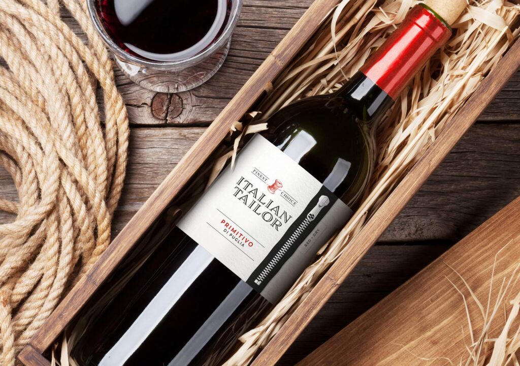
Italian Tailor is an Italian wine evoking fashion style and a sense of class. The guiding theme here is tailoring. Thus, above the product name, alongside the inscription ‘Finest Choice,’ there is an illustration of a spool of thread. Cutting across the entire label is a stitched zipper, which looks fantastic on red wine, making it appear as if the strip is cut into the label. Add to this the printing on handmade paper, embossing, and we have the recipe for a great label.
Calto
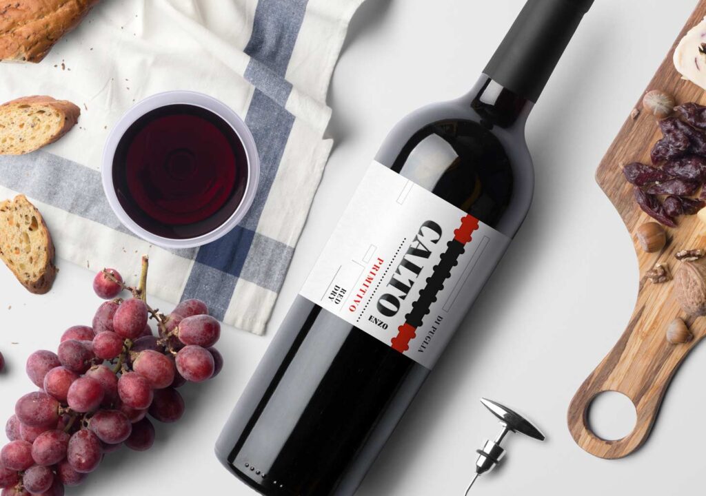
Designing the label for Calto wine was a pure conceptual pleasure. Playing with minimalist shapes, only two colors, simple yet expressive typography. A red color accent, a combination of dots, lines, and shapes. A beautiful concept warmly received by the client.
Let’s create something great together!
Request a free quote.
Contact
Similar projects
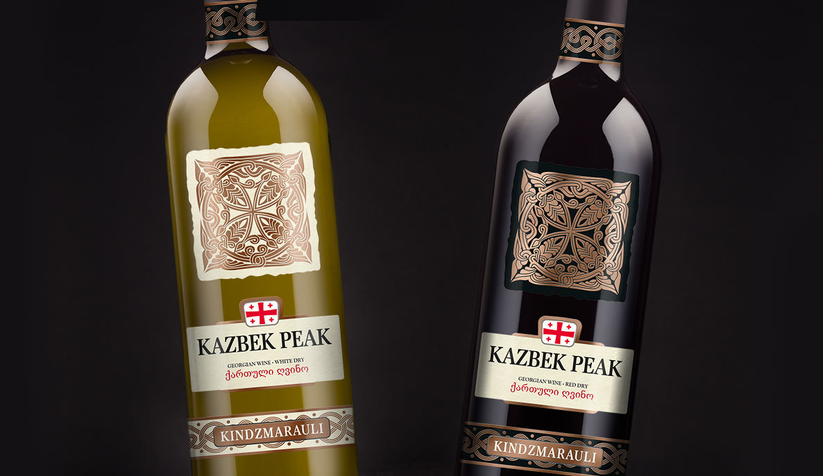
Kazbek Peak – wine label design from Georgia